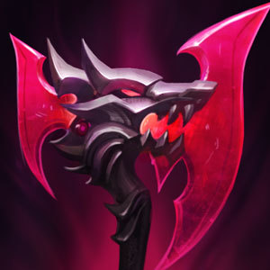
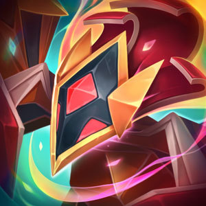
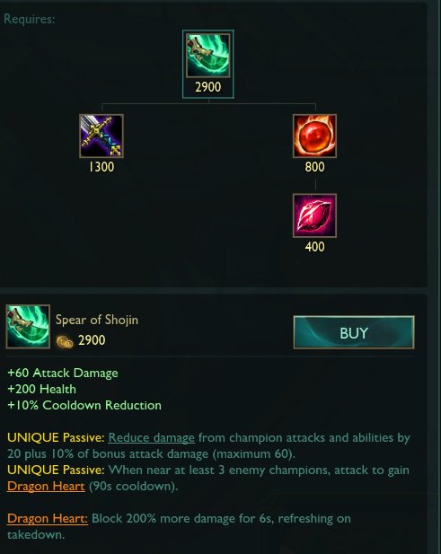
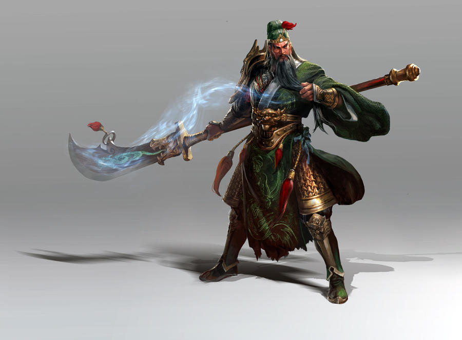
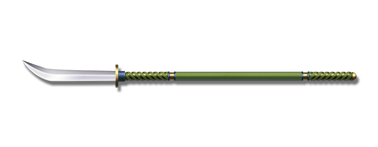
Spear of Shojin doesn't look like a spear anymore
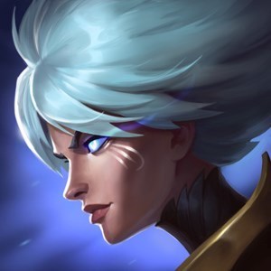
https://pbs.twimg.com/media/DeomqAPW0AANQCK.jpg
Is that even a spear? lol Might as well rename it to another kind of weapon cause the new art is good. Maybe Falchion of Shojin?
Falchion's look like these based on Google:
https://upload.wikimedia.org/wikipedia/commons/7/7c/Falchion.jpg
OFF TOPIC:
I might be late but I'm very unhappy with the new look/splash of Infinity Edge. Don't get me wrong, I love that riot keeps on improving the game but the icon is a downgrade for me. It look very cartoony and for me, it just needs a lot of tweaking. Maybe the proportions are inaccurate, the head of the sword is huge specially the arrow part and the body going to the handle becomes thinner? like whut?
Maybe take an inspiration out of this reference that i saw on google. Crop its proportions and maybe its a better icon than those two. https://i2.wp.com/es.me/wp-content/uploads/2018/05/Infinity-Edge-Item-1.png
I even see an out cry of a reddit post about this. Riot I know you're better than this so please change it while you can.
Sorry if I offended you guys/riot but i'm just stating the truth so that you could improve the game, fix your mistake and make it appeal to players more
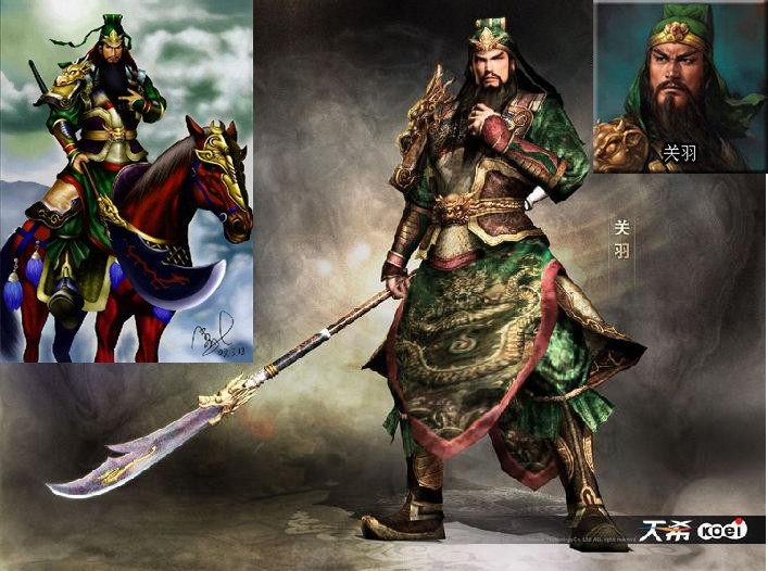
EDIT: As many have pointed out, it clearly is a guandao. I hope it will change to Guandao of Shojin or Shojin's Guandao. Thanks