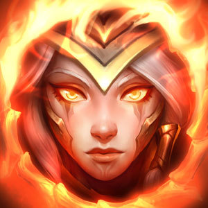
New Kayle's Champion Icon looks really blurry and low quality [Not another Kayle rant]

(For clarity, this is in reference to the icon you see when you lock in Kayle, or when you look at your owned champion page)
Seriously, I know it's because it's just a heavily zoomed in splash, but that icon needs some work. It looks seriously bad compared to the icons of newer champions, more akin in quality to 2nd classic Kayle's icon. It would be great if Riot could just touch it up a little bit.