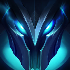
Riot just gave me a reason not to try and climb above Diamond next season
Malicious Metal·10/2/2018, 8:25:06 PM·48 votes·21,391 views

https://pbs.twimg.com/media/DohYaizU4AEqbh8.jpg:large

Whether it's because of the Masters emblem looking worse than Diamond one or the latter vaguely resembling Mordekaiser's helmet is up for debate. Mordereworkconfirmed?

62 Comments

CJXander10/2/2018, 9:16:10 PM36 votes

I really hope they won't get through with this! the current badges look representative for each tier, while all these look the same.

ZevBenjamin10/2/2018, 9:05:45 PM28 votes

Why are the even changing the emblems? The current ones are so iconic and look so good (especially with the shines and gems in them), is it just me that feels this way?

Akali Prime10/2/2018, 9:34:23 PM14 votes

i dont like em

CAPS IS TOXIC10/3/2018, 12:26:29 AM10 votes

They are all so dull-colored...

Infernape10/2/2018, 8:30:41 PM9 votes

Diamond looks like a really pissed off Mordekaiser. All it needs is red eyes where the eye slits are.

Just the Lip10/2/2018, 9:57:42 PM7 votes

New icons look like garbage.

plat looks worse than gold, and as a hardstuck plat player this upsets me.

DunkmasterDennis10/3/2018, 12:48:24 PM4 votes

the colouring is so faded and dull

Agent Corgi10/2/2018, 8:30:30 PM3 votes

From Platinum and onward doesn't look too shabby, not too shabby at all. I really like the diamond design.

Snowyalice10/3/2018, 2:27:57 AM3 votes

Tbh I'm kind of disappointed with the gold design.. someday I've wanted to actually take the time to climb to gold since it seemed doable and the fact that i really liked the why it looked but now it's just very dull and grey instead of the bright shiny gold we have currently.

TzQGRUST3910/3/2018, 4:15:01 AM3 votes

I really like the idea of the rank emblems representing the regions of the lore, but I don't think I like the execution here. I'd really be in favor of a redesign to make them standout from each other more.

Wolfeur10/3/2018, 11:03:24 AM3 votes

I mean, Morde is the IRON Revenant, so…

NaturesMayhem10/3/2018, 11:50:41 AM3 votes

Wait.... Is Iron really a rank now under bronze? I thought the posts about Iron were the same thing as "carboard" league, a jab at people who are beyond garbage at this game.

xWinnetou9610/3/2018, 4:29:41 PM3 votes

Gold looks like bronze and bronze looks like rusty tin [sg-ahri-1]

Sukishoo10/2/2018, 8:32:48 PM2 votes

Mordereworkconfirmed?

Well I do remember at least one Rioter said they'd be surprised if they went through 2019 without his rework so.

OlympicStalker10/2/2018, 9:10:23 PM2 votes

WHAT ARE THOSE

Blackii710/2/2018, 11:20:32 PM2 votes

The designs are really really underwhelming. They said it was to make it more "Faction-Like" but it really just looks meh.

How are they convinced that the ranked emblems look anything like this?

https://imgur.com/a/6vdI8K5

Kairoptra10/2/2018, 11:25:31 PM2 votes

Would you shut your fucking mouth? He literally says in EVERY POST WITH THOSE ICONS that they are NOT the finished product.

rtbf22561824110/3/2018, 12:09:20 AM2 votes

Shouldn't Gold look more...Yellow?

And Platinum should honestly just be made dark blue or a bright strong green. It looks like a bigger Silver.

I mean...given my experience with it i'm not surprised if that's the intent.

Resolution10/2/2018, 8:40:32 PM2 votes

Hey, at least we'll finally see Mordekaiser ;).

Stars Shaper10/3/2018, 11:53:14 AM1 votes

Last one is basically a Fifth Age Mordekaiser skin teaser.

Lv60 Retri Pala10/4/2018, 10:45:17 AM1 votes

If you showed me the gold icon without the bronze one to compare I'd assume it's the bronze one.

KNÍGHT10/3/2018, 12:45:59 PM1 votes

Reminds me of Smite -> Hi-Rez

DeracadaVenom10/3/2018, 4:59:49 PM1 votes

I mean they’re decent, the last ones were better But isn’t it about showing what rank you are? Might as well brag with a master rank right?

Mr209e2s10/3/2018, 10:26:05 AM1 votes

[{quoted}](name=Malicious Metal,realm=EUW,application-id=6kFXY1kR,discussion-id=Es5hItTF,comment-id=,timestamp=2018-10-02T20:25:06.653+0000)

https://pbs.twimg.com/media/DohYaizU4AEqbh8.jpg:large

Whether it's because of the Masters emblem looking worse than Diamond one or the latter vaguely resembling Mordekaiser's helmet is up for debate. Mordereworkconfirmed?

Should be hppy, it could be beta-S1 and just show you your numbered elo (MMR) that climb, but then again I was only silver then

Hügö10/3/2018, 10:53:23 AM1 votes

When the loading screen borders are in need of a redesign then they do this >.>

MarkedOfKane10/3/2018, 7:34:26 PM1 votes

I think the old emblems were significantly nicer. These new ones are basically all the same but with a slight color change. The old(current) ones get more exciting looking as the rank increases.

WøOxer10/4/2018, 8:51:37 AM1 votes

So much hate about Icons?

I dont give a F lol