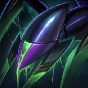
Feedback on Kindred's Splash

https://am-a.akamaihd.net/image?f=http://news.cdn.leagueoflegends.com/public/images/pages/2015/kin/img/Kindred_Wallpaper.jpg
Does anybody else feel that Wolf's mask should be a touch brighter in the splash? When you first come in contact with Kindred as a champion, it's a little bewildering to comprehend the theme behind the champion without getting further context from the lore. IMO, it's difficult to create a rapid connection with Kindred because Lamb isn't easily identifiable as a lamb and the Lamb mask isn't easily separated from Wolf's form because it blends into him a bit too much. I know it's supposed to be in shadow, but I think a little brightness would provide some much needed clarity and readability.