New Shen splash critique

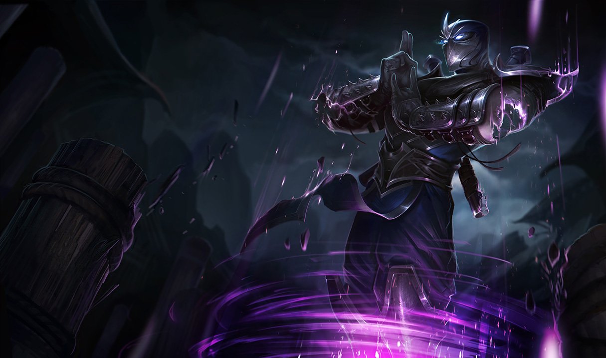
A few people in the other threads have expressed that Shen looks too menacing in the new splash, and that was also my first impression when seeing it. Shen is supposed to be the calm and serene protector ninja. The antithesis to Zed given their lore, and even if his lore gets changed, Shen's kit and VO obviously reflect this as well.
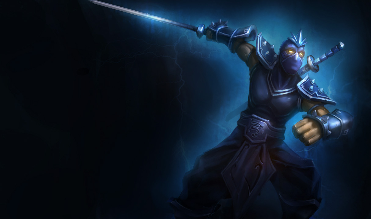
I think the problem lies most heavily on the positioning of his head ornament. It creates a sharp frowning look, even though it isn't part of his face and he isn't frowning. The distinct lines on his mask also accent the downward angled brows/eyes of a menacing look, but are less significant to the problem.
Current splash, note the head ornament location: http://img1.wikia.nocookie.net/__cb20120130034416/leagueoflegends/images/archive/b/b9/20141013221135!Shen_OriginalSkin.jpg
New one: http://3.bp.blogspot.com/-jVyrJosBbgk/VDwqU2lRXXI/AAAAAAAAbKc/FqICli7tM_w/s1600/Shen_Splash_0.jpg
and here is my quick edit concerning the aspects I mentioned. I moved his head ornament up to match the old art's position and softened his mask lines. I think it totally changes the feeling you get from looking at him into what it should be. http://i.imgur.com/AcxyPsR.jpg