The good and the bad of Fiora's new visual design: A low-sodium, in-depth breakdown
First off, I am not a Fiora main. Just a person who plays the game and likes to study character design. I think Fiora's new look has a lot of good things about it, but I also think it has a lot of things that ultimately don't work. I know she's on PBE now, so while I think it's probably unlikely that Riot will do a major overhaul, I'm hoping we can see at least some iteration over the course of her stay there. I know Riot's listened to skin feedback in the past, and I've got my fingers crossed that the same holds true for a full base redesign (or I would, if I didn't need my fingers free to type).
A couple of notes:
- This post only discusses Fiora's new base skin (with some comparison to the old base skin). This doesn't discuss any aspect of her gameplay update, which, by the way, I think is orders of magnitude better than her current kit, even if an AoE-healing ult is a bit of an unusual choice for a grand duelist.
- This post is just about what I like and dislike. I'm not speaking for anyone else, except where I note I've seen similar sentiments in other threads, and I'm not pretending this is anything other than personal opinion. However, I think it's personal opinion with a lot of solid points, but then again, I'm pretty biased in my favor.
And some links, so we're all on the same page: Old and new Fiora comparison, courtesy of S@20: http://3.bp.blogspot.com/-rZQCYTXb-vE/Va7GweHp4WI/AAAAAAAAFIU/BRwBK3yUSSE/s1600/fioracompare.jpg
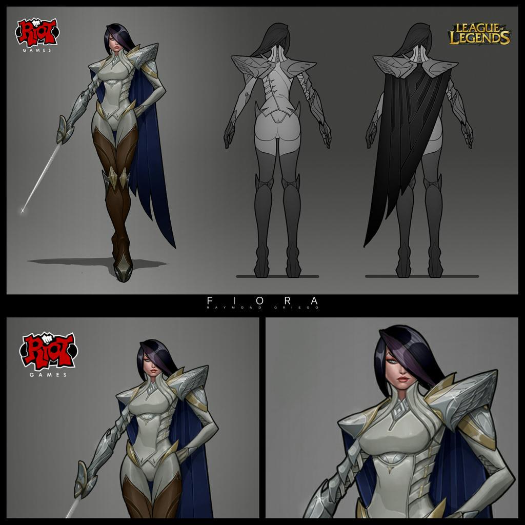
New Fiora turnaround, also courtesy of S@20: http://1.bp.blogspot.com/-Z-2vC2pbA7w/Va7E7O34scI/AAAAAAAAuAQ/PCOilQkj4ss/s1600/fioraturn.jpg
Fiora redesign concept art, courtesy of multiple threads on reddit and the boards (though I think Zeronis was the original artist, someone correct me if I'm wrong): https://pbs.twimg.com/media/CKffcneUkAAUdvz.jpg
Old Fiora in game, courtesy of Google: http://riot-web-static.s3.amazonaws.com/images/news/February_2012/2012_02_24_fiora_reveal/6.jpg
That said, let's get to it.
New look, the good: Sword design: Her new sword is one of my favorite parts of the redesign. The gold hilt with the swirly lines and the teal jewel really make it stand out as a beautiful reimagining of a standard fencing saber. It feels much more as though it belongs on a Demacian character, without hitting you over the head too much with the faction's flavor. (Plus, the point on the top of the crossguard sort of reflects the points on the tips of the hair framing her face.) It's a little bigger than the old version, but that's okay; the larger size calls attention to the fact that it's the source of her power, like Darius’s axe or Katarina's daggers. It's less realistic, but it makes it a lot more readable in-game. Overall, a much lovelier, more elegant weapon.
No more blue catsuit: You could make an argument that the blue catsuits are just The Thing for Demacian women to wear (Vayne, Lux), but I think the faction's flavor would be a lot stronger if you didn't. Fiora's new clothes look more like what a fencer would actually wear, while still clearly identifying her as Demacian. The white shirt and single full-length stripe on each leg make her look a lot cleaner overall. I mean, I'll be honest, I think her previous design was just fine, but I definitely appreciate her in-game look reading a lot more like a traditional fencer. She just looks a lot stronger as a character without her base outfit matching that of at least two other people.
New colors distinguish her from other Demacians: I like that you're trying a variation on the standard Demacian blue-and-gold color scheme. The teal and white with gold trim is quite striking. This is kind of a corollary to the previous point, so I probably don't need to say too much about it. It feels like you're finally starting to break the current Demacian mold, which can only be a good thing. Depth and variation is awesome.
New look, the bad: Massive shoulder pad: I feel like I can kind of see what you were going for with this. It's her main source of armor, so you make it outsized, like her sword (the source of power), right? But in this case, I really, really don't think it worked. Honestly, it reminds me way too much of one of those suits with padded shoulders from the '80s. I love the design on it — the kind of concentric circles, the teal jewel that matches her sword's crossguard, and the pointed shape (hair, crossguard) — I just think it's currently way too big. That's a lot of weight for a fencer to carry around! It just makes her look so clunky and awkward, not sleek at all. Honestly, something about the size of what's on her right shoulder would look really good, though I understand that you want the side not holding the sword to be more protected.
Asymmetrical collar thing: One thing I really liked about Fiora's old design was her high collar. It looked like it protected her neck well, while maintaining a regal appearance. It made a lot of sense for an arrogant fencer from a noble family. It was streamlined, which meant it wouldn't inhibit her movement at all. I am honestly not sure what you're going for with the new collar. It's sort of this massive pointy thing off on her right side, which makes it difficult to see the armor on her right shoulder. The inside is pink, which distracts from the color on her hair. And it really just looks like it would get in the way when you're trying to look and move around. I feel like a fencer in particular, even a noble one, even a fantasy one, would want to keep extraneous frills to a minimum. And while I can appreciate the repetition of the pointed shape in her overall character design, I ultimately think this is an incredibly distracting element of her outfit. It's especially distracting from above, where we can see down into it. It really makes it unclear what's going on with her general neck and shoulder area.
Torso armor looks too large and clunky overall: Basically reiterating what I said in the previous two points. While I can see what you were aiming for with the redesigned torso look, I just think it's really unsuitable for a fencer, who relies on speed and agility to defeat her opponents. In the end, she just looks kind of blocky and un-aerodynamic. Honestly, I think the concept art I linked above really nailed a lot of what her rework should have looked like, specifically in the collar, upper and lower right arm, ribcage and stomach areas, hips, and boots.
Hair too symmetrical: I realize that it's much more practical to fight someone when you can see out of both eyes, but the asymmetry of Fiora's old hair looked much more dynamic. There was a sort of motion on her face as well, but not a distracting one. She looked a little daring, a little rogueish, and considering her character's pride and focus on image, I feel like that haircut ultimately suited her better. She looked vain, which was exactly in her character as the grand duelist. Besides, as others have said, the current haircut has a very "let-me-see-your-manager soccer mom" feel to it, which in my opinion is very much not Fiora at all. However, I can see that her new shirt has a stripe down one side and an asymmetric hem, so perhaps you tried her old hair with that (as her old outfit was almost perfectly symmetrical) and decided that was too much asymmetry for one character. I can certainly understand that; at some point, the details become a distraction, and you definitely have to balance elements that give the design motion and elements that hold your eye still. So if that's what you found, then maybe a new haircut was necessary. But this one is not a good fit for her. She doesn't look dashing — she just looks unpleasant.
Face too sharp/angular: Others have touched on this as well, but her new face is so distracting. It's a bit less noticeable in the attached screenshots, but overall she looks much, much older. This isn't really a matter of what fits her character or not; I just think the slightly fuller face and less deadly cheekbones straight up looked better.
Massive lips: Similar to my previous point, her new lips are so large, I find them incredibly distracting. They just look really out of place, especially on a face as narrow and lean as her new one.
Tights with no boots: I get what you were going for with the stripe on her pants. I like it, even. And I could understand if her old boots had so much detail as to be really noisy in game, but I honestly think it's kind of weird that it looks like she's running around with just tights covering her lower half. If I look closely, I can see little shoe-like details on her feet, but they just kind of blend in with the rest of her legs at a glance. On top of that, her tights as they are now just look like they were lifted straight from a medieval painting, which just doesn't really work for me. Her old boots helped break up her silhouette really nicely, especially with the way their tops were cut into points to match the rest of her, while making her look a little more well-protected. Now, especially considering her gargantuan shoulder armor, she just looks really top-heavy without anything to balance her out. And maybe that's what you want, but I don't think it's an especially attractive or pleasing look. Perhaps there could be some sort of compromise with knee-high boots that flared out at the corners.
Cape is a large blocky shape covering her back: Again, I really like the gold trim and teal jewel on the edge. I can even get behind the white on the main body of the cape, even though her shirt is white, because the cape mostly covers the back of her shirt. But I can't really see her under the cape — it takes away any recognizable silhouette and just turns her into a large piece of fabric. As with the left pauldron, it looks really, really clunky. The inside of the cape being pink works, as it's not too close to her hair and distinguishes it from the rest of her outfit, but in terms of overall shape, her previous three-strip cape made her look a lot more agile. The thinness of each piece reinforced how slender the rest of her was and how difficult it was to hit her.
Old look, the good: Sleek, streamlined, aerodynamic, mobile: In Knockwurst's YouTube series about the making of his recent fanmade Ahri splash, he talked about the "pillars" of a character's design. These are just some keywords that you keep in mind while you design your character, so that you ensure that every element of the character's visuals (and pose, in the context of a splash) gives a clear sense of who they are. This is important in-game because it means that you can take one glance at a character and immediately have at least some of an idea of what they do, e.g. no one's going to look at Leona and think she's an assassin. Similarly, no one could look at old Fiora and not see these four words staring them back in every polygon of her character. Fencers are light, mobile, and can't really afford to have a lot of extra stuff sitting around on their outfit. Naturally, this is a fantasy game, so there's a bit of wiggle room (see: cape), but at the end of the day, I feel that Fiora's former close-cut silhouette gave a much stronger sense of what she was supposed to do. She had plenty of protection, even though her armor was light. Her tight-fitting arm armor and her boots in particular looked really good, and her split cape looked much lighter than the new solid cape. Side note: I can appreciate that the new bracer on her right arm matches her sword, and I think the overall style has a lot more flavor than her previous generic steel plates, but as with her new left-side pauldron, I do think it could stand to be scaled down somewhat — her new right arm looks beefier than it should. And I liked her little half-jacket; somehow, with that collar, it just looked really classy.
Old look, the bad: Even though it had more detail, it was kind of dark and maybe a little generic. The red on her collar clashed a bit with her hair. As I said before, her blue catsuit didn’t distinguish her much from other Demacian women, or really make sense with the fact that she was only wearing chest and leg armor over it. I could see her armor potentially being a little visually busy for in-game, along with the gold design on her split cape. Not really sure what was going on with her old chest armor, either, or the belts. I'm definitely liking the new, less cluttered shirt area. Overall, sure, it could have used some improvement. But I think there were a lot of good fundamental ideas there that appear to have gotten thrown out in the rework.
If any reds see this, or even make it this far, I know you're dealing with a lot of crap over this. An awful lot of people just don't like change, and are bad at communicating details of things they don't like even when there's a legitimate concern. You don't necessarily have to respond, although a red post always brightens up my day, but I do hope you'll at least take this as some food for thought. And red or not, if you made it this far, get yourself a cookie. You earned it after scaling that wall of text.
If anyone wants to discuss, let's keep things civil.