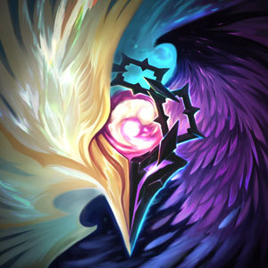
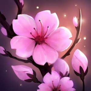
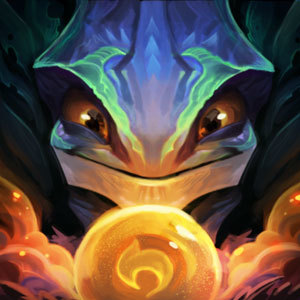
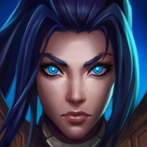
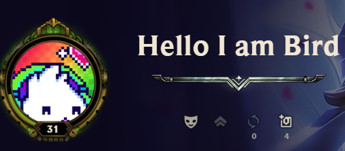
Proof of the summoner icon frame on the profiles MUST BE CHANGED!

Politely Pink·11/14/2017, 11:29:06 PM·204 votes·24,743 views

I'm really sorry if I may sound rude. My English is poor, so I can express myself in a limited way. Riot... this is really not okay... "It's an old icon" is a very poor excuse. And most of the following examples are not that old at all...

LET'S START WITH THE WORST ONE! https://i.imgur.com/yaLRQL8.jpg https://i.imgur.com/l06vlaD.jpg https://i.imgur.com/KrwAOKh.jpg https://i.imgur.com/sac0QOT.jpg https://i.imgur.com/87v6eTN.jpg https://i.imgur.com/b23bD4A.jpg https://i.imgur.com/LHwfaO9.jpg https://i.imgur.com/hFcMx6I.jpg https://i.imgur.com/aBuwzqq.jpg https://i.imgur.com/Ib2QLfx.jpg https://i.imgur.com/OVWVCfG.jpg https://i.imgur.com/DCCoN8u.jpg

Please post in the comments if your icon which is not included in the following examples is ruined as well to let Riot know this circle surface is really bad! Circle icons is just a trend which came in like 2013. This trend will disappear within a few years. There is no point to ruin our icons just to be trendy!

71 Comments

SylvanasWrunner11/15/2017, 12:08:52 AM24 votes

I was considering making a post about this particular situation with the enlargement of the icons, but I was debating whether to do or not to do. Glad someone finally pointed this one out. It's really irritating at times. Plus the border made it worse, and previous ranked border didn't fully cover much of the icon. I like seeing the full hair of the Sacred Sword Janna icon as well as the whole DJ Sona icons, but now I can barely see the full detail.

And they should've just put both the previous ranked summoner icon border and this season's insignia.

Leonerdo11/15/2017, 2:53:33 AM11 votes

Yeah, I mean, obviously the corners of the square icons are going to be cut off when they are put in a circle. But why are they also have to be zoomed in? There's a few pixels being cut off on each side completely unnecessarily.

DRAGOON Burst11/15/2017, 1:11:58 PM6 votes

All these squares make a circle. All these squares make a circle. All these squares make a circle.

Altiverse11/15/2017, 5:33:19 AM6 votes

Yeah I'm still not sure what happened there...

Rioter A: Guys, guys! I have an idea. Rioter B: What is it? Rioter A: Let's put our square-designed icons into... CIRCLES! Rioter C: Squarely, GENIUS! Rioter B: Instead of squaring the circle, you circled the square! THIS IS THE ANSWER!

######Just. what.

Sukishoo11/15/2017, 6:04:45 AM6 votes

No, they just have to adjust how icons appear in them. I think the circle frame is fine.

flavSb11/15/2017, 10:11:40 AM5 votes

Why are the icons circles anyway ? They were way better when they were squares rather than circles. 99% of them are supposed to be squares anyway

Popstar11/15/2017, 1:15:32 PM4 votes

[img]https://i.imgur.com/Wz9TNM8.png[/img]

Guess when i achieved plat

Dr Poro11/15/2017, 9:23:59 AM4 votes

A poro needs a tongue. No tongue in picture, no snax.

Fairyfleur11/15/2017, 3:49:37 PM4 votes

Honestly they just need to be zoomed out.

Popstar11/15/2017, 1:11:56 PM4 votes

[img]https://i.imgur.com/b0zhyra.png[/img]

Was one of the best icons in my opinion.

Again, WAS, it WAAAAAAS. But now look at this. -__-

J5Cld2hgRx11/15/2017, 6:01:03 AM4 votes

OMG Thanks for uploading this!! My thread went down. Hopefully yours will stay top and Riot will see this

Please change the icon frame to square

https://boards.na.leagueoflegends.com/en/c/gameplay-balance/qWTyAlwA-petition-to-have-icon-border-to-be-square If anyone cares

Upvoted

TheGoddessBell11/16/2017, 3:34:44 AM4 votes

the first one needs to be zoomed out the second one looks fine the third one needs to be zoomed out the fourth one needs to be zoomed out the fifth one looks fine the sixth one looks fine the seventh one looks fine the eight one needs to be zoomed out the ninth one looks fine the tenth one is perfect the eleventh one is fine the twelfth one needs to be zoomed out

So it's about 60/40 in my perspective. Like I've seen a few others say, they just need to adjust them a bit more.

They indeed look fine in lobby, so they just need to adjust it so they fit the profile better. https://imgur.com/iZf7GZM vs https://imgur.com/JmhhLEQ

The Great Guava11/15/2017, 4:38:19 PM3 votes

Lmao really? Being a baby over a over a zoomed in Icon.[zombie-brand-facepalm]

MonkeyMadness11/15/2017, 5:38:42 AM3 votes

https://news-a.akamaihd.net/public/images/articles/2015/march_2015/upn/spatula.jpg

Should've invested in this bad boy. Still looks good.

Obvs this is not a screenshot. I'm just saying that even with the circle over it, it's still fine. 1337 spatula

kullehh11/15/2017, 11:56:49 AM3 votes

ikr its very ugly just like that ranked line we got this season , so ugly

Snaketits11/27/2017, 1:38:52 AM2 votes

Here's the latest affected icon, the focus on the forehead is real nasty. https://i.imgur.com/x3Vx6Oe

Mhihnj11/15/2017, 2:55:52 AM2 votes

the icon second looks like chrome rammus when zoomed in

Jerry SeinfeId11/15/2017, 12:21:24 PM2 votes

Just zoom out on the art, the circle looks beter with the new client.

Kloqdq11/15/2017, 2:20:25 PM2 votes

Even if they just tried to make them fit better. Like please.