Deathsworn Katarina is a wasted potential...

https://i.imgur.com/Tg4AToL.jpg Concept art ( by Zeronis ) vs Splash Art vs 3d model
Zeronis did a fine job with this skin concept. This skin could have been a great legendary! But despite to the new effects, it's hardly worth 1350 RP.
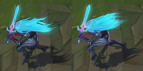
- The main problem in my opinion is the pose. Katarina's pose covers the details of the skin, and it makes the skin look simple.
- The second problem is the outfit. Purple doesn't match for the blue hair. They could have just keep the black dress with the collar. ( And please don't come with the children. League of Legends is 13+ and contains blood and violence. This game is definitely not for little children. ) The outfit on the original concept is really fine, beautiful and badass.
- The third problem, they didn't cath the hair color from the concept art. In the model the color of the hair looks really flat. We cannot see the shadows. The hair around the roots must be darker, and the hair ends should gradient into vibrating green/mint color. -The fourth problem is... in the side view she almost looks like Irelia. https://i.imgur.com/XmmnSaf.jpg