Art Feedback Mega Thread

RiotRiot JxE·9/25/2014, 11:51:10 PM·11 votes·8,787 views

Hey everyone!

I wanted to create a space for everyone to give feedback about Art in the game, as Iron Stylus mentioned there's a broad range of artists at the company:

  • Concept
  • 3D Character
  • 3D Environment
  • Animation
  • VFX
  • Motion Graphics
  • UI Artists

I want this to be a place all the artists can visit to see your most requested changes\fixes to the art and just to get some general feedback about how everyone feels about what's going on. While I won't be able to respond to everyone, I'm going to be keeping an eye on this and hopefully get information to the right people.

What this is for:

  • Feedback about our art decisions
  • Feedback on new art
  • Feedback about how art is affecting gameplay
  • Constructive Criticism
  • Letting us know what you think

What this is not for:

I'm excited to hear from everyone :)
38 Comments

Overlord Forte9/27/2014, 8:24:45 AM6 votes

In regards to Syndra's Syndra base skin, as a whole:

Over all, I don't understand the inconsistent design behind her original look. From her title, backstory, and theme, you expect a dark regal/noble being commanding tremendous power with skill/fluency not seen elsewhere. Her abilities animate and show well, her voice work is great, but then you get to her person/body and it suddenly goes sideways.

The helm is a magnificent piece (both in design and meaning) and works well with her head, but then her shoulders and torso fumble the look. Her shoulders have the beginning of swept upward spikes, a good compliment to the helm, but then she's left with nothing to follow up with. Her shoulder pieces are somehow connected to her body, while the rest of her torso is a flimsy 9.99$ set of bondage gear.

I mean, what? Why does an all powerful Sovereign share what Evelynn wears? Should I have the evocation of a floating stripper? Why does she have all this tacked on armor then? The sash is neat, I guess? It looks like it was added on to cover up the crotch shot she'd have from the extreme strap work going on.

Her arm guards/finger jewelry looks like it belonged to a different design - they work, but don't sync up with her torso. The same can essentially be said of the leggings as well. I've always been bothered by how unnecessarily sexualized her design is, even 500? something games and counting. She has great potential to show off royal(?) Ionian dressings/regalia, but that's just thrown out the window for no apparent reason. She doesn't gain anything but virtually having no torso clothes, nor does it really show much of Ionia itself.

It's just there for T & A, and I don't understand why.

RiotRiotForScience9/29/2014, 8:35:53 PM4 votes

Thanks for setting this up. I will try to stop by regularly to glean SR feedback

Marsmonkey9/29/2014, 11:03:23 AM4 votes

Hi there!

I wanted to tell you guys that I absolutely love the new Summoners Rift art and I 'm super exited for what's still to come and all the talk about the updated map and it's story. So this could be the right board to post some of my thoughts on it!

I got to test the updated map myself on the PBE, it is amazing how beautiful it is and the unique atmosphere it brings. Way to go!

However, there is one thing that I don't like about the current map on the PBE and it may sound weird, but it is the flowers in the lanes. There are some oddly shaped blue flowers everywhere on the three lanes and I personally think these flowers could be done better. I think they look weird because of the flower art, textures and the long peduncles. I just feel they don't compete with the other very nice textures of the map an that makes me sad, I know you can deliver better quality

On the contrary, I think that the flowers in the jungles are a very good example of how good looking flowers should be like, take a look for yourself!

I've added an example of the flowers i'm criticizing down below. Thanks for the hard work and for hearing the community like you do Riot.

Cheers.

Gixia9/26/2014, 12:03:57 AM2 votes

Figures, you make this thread after I've already made 3 different threads concerning recent art decisions. >.<

Well, where shall I start...

I am really not a fan of Leblanc's texture rebalancing. Specifically, her skin tone looks... wrong. Just very very wrong. Her new skin up on the PBE has a skin tone that looks pretty much perfect, could you just apply that colour to her base and the rest of her skins? Also, could you just take another pass at Prestigious skin specifically? For a skin based on a flamboyant, colourful profession like stage magician, it now looks really, really drab and dull.
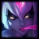
Second, I JUST posted a thread about Evelynn's TU, literally like a minute ago. Evelynn's update clearly goes beyond the realm of texture rebalancing into straight up texture update. My understanding though is that TUs are reserved for champs that already have solid rigs that hold up well, while Evelynn's rig is so bad that it's been stated she will never get a new skin until she gets a full on VU. Isn't all the work on the TU going to go to waste? Or is her VU just THAT far away? EDIT: In hindsight, the bit about Evelynn might actually be more appropriate in it's own thread rather than this one, but I'm not certain so I left it in anyways.
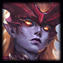
Third, Championship Shyvana. Once again, just made a thread about this yesterday. Short version: really excited she's getting the championship skin, but her dragon form seems a bit too heavy on the blue and feels like it needs a bit more of another colour for contrast, while her human form's face is kinda wonky looking. In the thread I made, SirSkillshotz made some VERY in-depth posts detailing just what feels wrong about her face.

Wintryphoenix9/29/2014, 10:13:32 PM2 votes

I know it's really not much of an issue, but Shyvana's new splash art is missing her tail-braid, which is featured in all of her other skins, including her old main splash. It's what threw me off of the new splash until I realized that was what it was. Is there any chance that it can be added to the new splash ever?

Really excited to see everything you have coming out for the rest of the year. You guys do such a great job.

Santasaurus9/26/2014, 7:19:17 AM1 votes

For the next Texture Update, may I suggest changing Ezreal's hair color from the McDonald's yellow to a softer/more realistic blonde? For instance, the current shade of hair color featured on Debonair Ezreal is pretty good. Thanks!

(His Base, Nottingham, Explorer, Pulsefire, & Striker Skins all have lemon-yellow hair... T.T )

Solideus9/26/2014, 1:06:00 PM1 votes

Could you change the colour-scheme on the new Warmonger Sion to be more similar to the old one? The new one looks a bit wacky and much less intimidating being bright purple and all.

cshakes9/26/2014, 1:24:36 PM1 votes

Models:

  • Malzahar and Kassadin both are purple in their Classic splashes, but not in their models. Fix?
  • LEONA HAS HEELS. Why?
  • Why does any female champion have heels?

Animations:

  • Why does Janna slap her ass during her taunt/joke (forget which)

Splash art:

  • Vayne's new splash is ... bad. It doesn't fit League's art style (looks like a comic book), it's too bright for Vayne, which direction is she jumping in anyway, and it looks worse than her previous splash
  • Shyvana's new splash is bad. I doesn't fit League's art style, she's strutting when she should be walking confidently, and she has a weird thigh gap.
  • Defender Leona's helmet looks too big.
Thanotos Omega9/26/2014, 8:53:31 PM1 votes

Copied whole sale from a thread i posted a little while ago,

I love Shyvana's new Splash art, Allot, It's made her my top priority to get now that i have Azir, What i really love is how much more Dragonlike she looks,

I wanted to know if when you work on her if this will be used as the base line to bring more unity to her skins, As she at present has the most disparate looking skins out of any champion i have seen, Each could be a different person and you wouldn't really know the difference,

Considering that she now has more to distinguish her then just Grey skin, Giving her one of the most stand out looks in the game among humanoids, It seems a waste that she has mostly skins that reduce the dragon effect so much,

I mainly want to see her eyes and scales carried over, Although i wouldn't mind seeing her New Skin tone used in some of them as well,

If not, do you think the skins team will make an effort to add a skin that fits more with her basic appearance?

Also I would like to again voice displeasure with the appearance of Shyvana's boots in her championship skin, I think more standard amor boots would be much more in line with her brutish nature and style.

Omnipherious9/26/2014, 8:58:43 PM1 votes

Feedback I think the HP value you've added for Sion's shield buff icon is a very nice touch. Definitely should be used more.

Suggestions Updated ability icons are a relatively low cost improvement that we don't see enough of. Some champions like Ashe and Tryndamere never really had any big changes, but you guys gave them spruced up icons, which was a nice little touch. While you're doing all these texture rebalancing, why not do a mass icon rebalance for champions like Rammus and Mundo too?

However, it's totally understandable to not update the icons of someone who is bound to get a more comprehensive rework like Poppy.

I'd also categorize item icons as a similar low cost improvement. I doubt these two take too many resources to do for the amount of visual improvement and cohesiveness they would provide.

Kobold9/26/2014, 12:27:17 AM1 votes

I'm going to put this here as any questions I have about the Boards gets "seemingly" ignored and unanswered. Why doesnt Art have its own section as the Story & Art Board gets too congested with each other and seems to make it so that if one wants to see the Story discussions they have to wade through 10x as many posts regarding art when they are just looking for something regarding the Lore and such. The vice versa would be true during lore retcons, why are they on the same board when they are not two sides of the same coin but two separate entities entirely in the game design process. they are brought together for things like the lore events but are otherwise on the opposite spectrums in terms of design.

Thanotos Omega9/27/2014, 8:00:54 PM1 votes

This really isn't the place for us to be having this argument,

My Fancy Pants9/26/2014, 12:19:57 AM1 votes

This is something that I have been thinking about for a little bit of time now.

I would absolutely love for there to be greater visibility to the amazing splash art that is created for each champion and skin. Far too often I feel like I only ever experience the champion profile picture during loading and never get to see the rest of the gorgeous artwork going on beyond the confines of the profile.

One potential Idea I had would to be to replace the black background of the loading screen with the full image of the spalsh art in the background. It could be similar to what was seen in the recent Ascension background, but specific to whichever champion or skin you've selected.

It wouldn't need to show everything (as it would be occluded by loading portraits), but could bring a greater visibility to the amazing artwork that already exists.

Keep up the great work though, it's been great seeing the style evolve and improve over the last few years.

Flemman9/26/2014, 12:12:51 AM1 votes

On the art discussion, one question I keep can't find an answers is why blood moon akali mask don't match her splash mask (at least for the painting) From where come this yellow dot on the front in game?

Santasaurus10/2/2014, 6:47:19 AM1 votes

Quick post: Please re-consider LeeSin Lee Sin's Face in the new splash art!

Here are some examples of the small yet effective changes you could do to his current Splash Art in the works:

http://apollo-na-uploads.s3.amazonaws.com/1412133577335/oLaLZJh.jpg http://apollo-na-uploads.s3.amazonaws.com/1412127920440/lee_sin_version2.jpg (Images by summoners KALOZ & Z0R KAMUI)

Lumus Avatar9/30/2014, 3:44:45 PM1 votes

It may still be early in the game to say, but I was playing on Howling Abyss the other day and I noticed as I was using Iron Solari Leona, her model appeared very dark. There were heavy shadows over large parts of her body, making her color scheme feel very different.

I wasn't sure if this was part of a new dynamic lighting algorithm for champs so I'm not calling it a bug. I just felt that the lighting I experienced on Howling Abyss reduced some of the clarity about Leona. It was harder to pick up on her exact location as the shadowy lighting made her blend a bit with the darker portions of the bridge.

I also bring it up because it seemed a significant change in feel from when there was no dynamic lighting and from any angle her armor gleamed brilliantly, like a champion of the sun. The new texture feels very soft, and pastelle like the new SR, but it seems to have come at the cost of her radiant color scheme to some degree.

Anyway, not a complaint, just an observation and a general feeling from someone who loves Iron Solari Leona. Thanks!

Duke Anax9/30/2014, 4:04:30 PM1 votes

Well, the name Summoner's RIFT never made mouch sense it being in a forest, but why did you decide to now make it into a mountain peak of all things?

topgunLT110/1/2014, 4:03:03 AM1 votes

Well i'l be making a lot of request/feedback

MAP related ( SR update )

#1 : Add a visual animation for the tower hits just like how the champions have hit animations

The tower needs an attack animation like champions since it already has a break between each of its attack making it possible for utilizing its down time to harass the enemy under the tower while the player is also within the towers attack range. Its kind of pointless for experienced players as they know the timing but for newcomers it'l make sense as they would be wondering as to why the tower didn't attack the enemy champion while the player was being damaged by the enemy under the his own tower. The particle effects and the sound indicator you guys added in 2013 was a nice addition but now adding this extra tower hit animation will make it even more clearer. Just like how champions move their arms to indicate an incoming attack,the towers also needs them too since they deal a lot of damage.

#2 : clouds/fog/mist/flying creatures as fog of war

i would love to see a different approach towards showing fog of war than just with shadows that's being used currently. Can u guys use some smoke/fog effects in certain areas since already there r regions where it rains. So instead of using the same shadow everywhere u can use different effects based on different parts of the map, like how you guys did with the rain effects on the new SR map. How about some clouds too to go along with this. I've always liked how in the old/current SR map and in the SR update we can see the shadows of moving clouds on the ground. So i thought since we players view the map from top it would be better to have some clouds to go along with it too. Just make them transparent but still visible. But alas this has a problem of disturbing the players vision :(

#3: Add more details to make the sky come alive along with the cloud I mentioned in the 2nd point.

I love how the map is more alive than before with non interactive creatures (clearer and better than those flies,ants of the current SR map). The rain makes it more organic and alive than pure virtual look, but why its always raining only in that same red side blue buff spot ??? :( How about adding some shadow of flying birds/dragons etc just like how its done with the clouds that's there on current and updated SR. Also make some of unique animations or things pop up once a while when the player plays the game, these objects should occur rarely/randomly but never for all the matches. This kinda makes the map last more fresh as the player keeps finding new stuff. Just yesterday when i was playing the SR update on custom i noticed the creature standing next to the middle tier 3 tower's stairs, and as i walked towards it with my champion trying to see it more clearly zoomed in it ran off :(. Would love to interact with those creatures like how we can do with the poros on Howling Abyss.

#4 : requesting to hide the fog of war areas completely by using clouds {This is not a repetition of my 2nd point}

The problem of playing games with this view is that we loose the sense of exploration and remembering areas that we can't see. 3rd person games and 1st person games all have that unique feel making it really fun to explore the hidden areas of the map and remember the terrain structures. Hiding the terrain and the rest of the map that's in fog of war is possible by using the clouds like i mentioned earlier. This also increases the skill cap of the players as they r now required to remember the terrain of a distant location from his champions/visible area's current location. Its not necessary to completely hide the areas hidden by the fog of war but its good to have certain parts being blocked by some obstruction like clouds if its in fog of war.

Kobold10/1/2014, 9:44:44 PM1 votes

So JxE you told me to put it in the Dom threads and that I would eventually get a response. Well I suppose telling me to dump it there to be abandoned works in Riots favor. So now where am I supposed to put my thread, in the Summoners Rift board? Oh wait its called Maps and Modes but is url'd as Summoners Rift. So seriously where am I supposed to post it cause there is no place that Riot would care anymore. Remember something is only as good as its weakest link and if abandoning Dominion and leaving it as a Bot haven is Riots choice then it seriously needs to reevaluate its priorities. I along with many others have given ideas and option to improve it and promote it so people will actually play the mode but if Riot doesn't want to get the help the community and myself are willing to give then when the walls come crashing down don't say you didn't see it coming. I am willing to SINGLE HANDEDLY work on the Crystal Scar VU if necessary, if MWAB is the only person in charge of TT, ARAM, and DOM then there is a serious lack of manpower that a company of Riots size needs to address.

I want Riot to succeed but fighting or abandoning what you created just because you don't like it isnt the approach to take. I am very critical of Riot as I see them slowly going the way of EA in terms of actually listening on most subjects. I dont want you to become the Next EA and just out right not care what the players think (Hello the C&C players) which is what the dom community is feeling and you ARE losing paying long term customers and even short term customers that are finding the alt modes more engaging or fun than Classic SR. I don't even play Dominion but I care because thats what a person is supposed to do is care for others hardships and try to help them if possible. I'll say it again I'll do the CS rework myself if needed, I'm not even skilled in modeling or animation but I am skilled in level design. Most people are scared their talents won't meet their own expectation so they are scared to even try, this is why I havent applied to Riot is I don't think I have the experience or skills that Riot wants, but I have the drive to get it done which seems more than Riot wants to commit to Dominion.

In closing i'll ask a few questions, What is the plan for CS visual wise? Why has Riot abandoned Dominion? Why is there only MWAB on the Alt maps team? Why has there been zero promotion for Dominion? Why would you tell me to put a thread somewhere knowing that the forums would be closed soon?

Kareaux9/26/2014, 4:23:35 AM1 votes

Well, here I am writing yet another comment on how I love the Riot art department. :P

  • I would love for this thread I created to get more visibility: guys, the art in League of Legends is AMAZING. But who creates it? If Rioters are okay with sharing their blogs, websites, portfolios... I would love to get some links because I need to feast my eyes on pretty and badass art.

  • Shurima event: I can't say this enough, but really I LOVE LOVE LOVE what you did with the videos. The visual storytelling was amazing, I loved the graphical style of it, I can't tell how many screenshots I took to get myself a new wallpaper. The animation, the transitions, everything was perfect and I loved it so much (also, Reddit thought the way the story was told was pretty bad: i thought it was great, like Nasus was telling an old legend or something, and it fit perfectly. And old legends aren't made to be super detailed with everything explained.) Great job guys!

  • Splash art updates: THIS IS SO AMAZING

  • Recent texture updates: I'm not sure I'm a big fan of Orianna's. The "skirt" looks great, i love the effect on max quality graphics, but her hair isn't quite as shiny and it looks really weird with the darker grey skin tone. I loved her previous metallic skin, it really looked like chrome or something- the new one doesn't give that feel, and it doesn't match the hair. Most TU are awesome though, particularly Leblanc's who finally looks like her splash (and she's beautiful).

  • Summoner's Rift VU: It's super cool! But... I kinda wish it was closer to the live SR's light/saturation (not necessarily as super-green but at least a little less darker, and maybe yeah, more saturated. I know you want clarity but actual SR doesn't bother me, I'd miss the "cartoony" & colorful look).

Other than that, I don't have much to say. I just want to thank everyone at Riot for making such diverse characters, amazing visuals and so much great content overall. You guys are awesome.