Thank you for the Lissandra skin Riot!
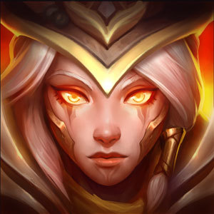
3/22 PBE Update
I'm so happy...It's all I've wanted...and it looks pretty cool! I can't wait to see the particles. I hope there's voice processing.
I'm so happy...It's all I've wanted...and it looks pretty cool! I can't wait to see the particles. I hope there's voice processing.
She has new particles, new sound effects and yes, voice processing! I'd love to hear your feedback once you get a chance to take a full look at her! ^-^
I'm so excited that you feel that way! I worked on the concept for this skin way back mid 2015 and it's been a pleasure working with an amazing team to bring it all the way to fruition. As a fellow Lissandra player I'm equally excited to play it >xD
As Katey said a lot of work goes into a Lissandra skin and the team went above and beyond with this one. I can't wait to see what you think of the full package so please let us know.
Now if Lissandra got an actual passive I would be soo happy...
I already have blade queen Lissandra, sue me >.<
From the picture, I honestly thought this was a joke about Sion's new skin being for Lissandra. I hadn't heard about the program skins until now. They look really cool!
This is all I've ever wanted for my favorite champion. Thank you skin design team! You guys delivered in every way possible with this one :D
As I posted elsewhere:
The V shape revealing the midriff cables is much larger and goes much lower on the in-game model. I think the narrower, shorter version from the splash looks better because it makes her look more shapely and makes the bottom half look more like a metal dress.
The splash has smaller shoulders and a upper arm "plates," emphasizing the fact that the arms are foating/disconnected. That's super badass, and it's almost completely lost visually in the game version.
The game version is a completely different color than the splash, which is mostly teal with the eggshell stripe down the front of the breastplate.
The off-white robot plates look amorphous and undefined, especially on her arms. The gray shading is not dark enough to communicate depth, perspective, or that the plates are jointed. It looks like mottled blobs. This also applies to the triangle pyramid at her feet.
Insert my recurrent complaint about X skin being beautiful and wonderful, then processed through a filter to desaturate the colors and desharpen all the lines/details before being shipped.
Spectacular concept, but it looks unfinished, especially next to the brilliant splash. The animations and spell effects look awesome, but the triangle base looks even worse in-game. It's just such a shame that all this time is spent creating wonderful art that gets pushed out looking so muddy and diluted.
She actually reminds me of the YoungLady Process in Transistor. Now I fear she'll spawn a lot of minions after death...
I don't like the thing at the bottom of her . . . . the green . . . digital effect. I wish that was completely removed, or at least more transparent and lighter, and we were left with just like a bottom half of her. You see floating robots like her all the time and it would have been cool to have a skin that didn't have that ugly effect at the bottom of her. Like it could be that white robot from Wall E . . . . whatever her name is.
Just wondering, is the new Sion skin at all related to Gypsy Danger?
I love these new PROGRAM skins, totally EPIC. They beat the PROJECT line :D (and I have all of those). Can't wait till we see what other creations come in the future.
We have GLADOS Lissandra. Sweet.