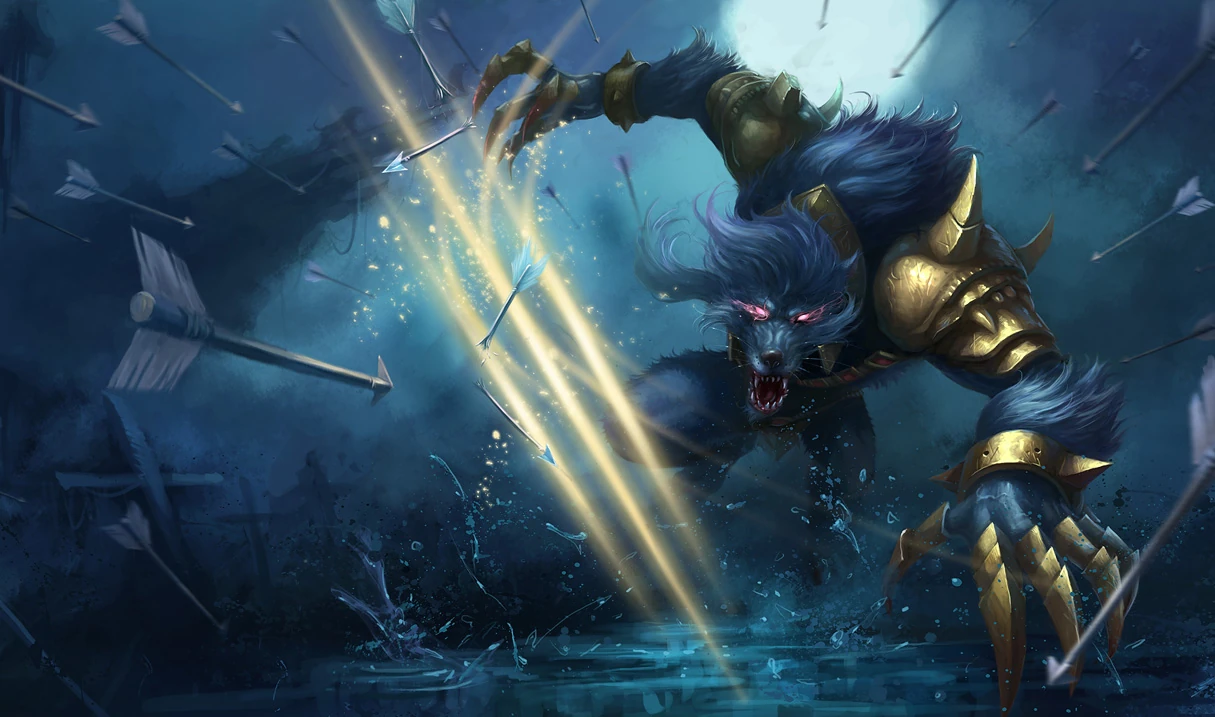
So for the Second Time, Older but Good Splash Arts are Being Replaced by Crappy Chinese Ones...

The Loli Support··113 votes·14,132 views

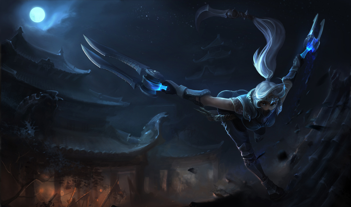
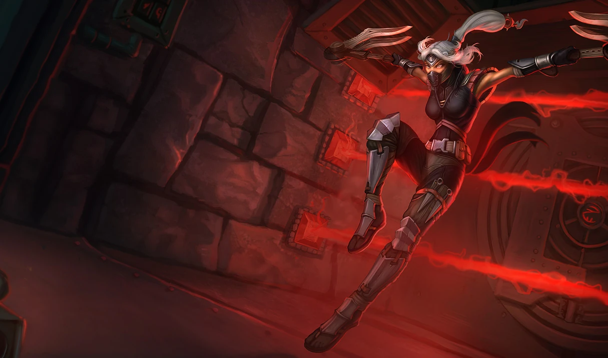
The first time this happened was when the marvelous, full of life splash of Blood Moon Akali was replaced by a slightly higher resolution, but far less lively and interesting one from the Chinese client one. I was unhappy then, as the first skin I bought was Blood Moon Akali, and to a large degree due to how much I loved the old splash art. Eventually though, I forgot about that.

I had seen the Riot Art Team become amazing, and pull out some really spectacular pieces, most recent of which the new Poppy skins splashes. I had really started growing hopeful. So when I heard that all old splashes are getting updated, I did not even think that they would repeat the fiasco from a few years back. I was thinking we'll get something Poppy-like for all the old splashes. Oh, how wrong I was.

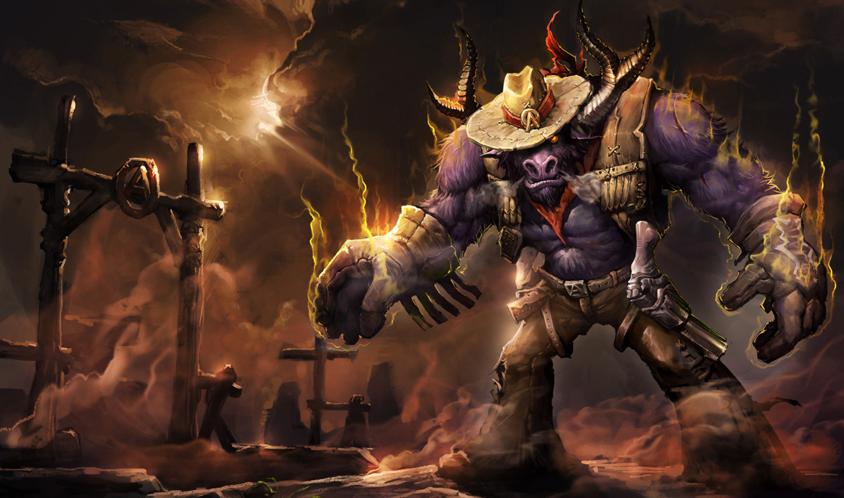
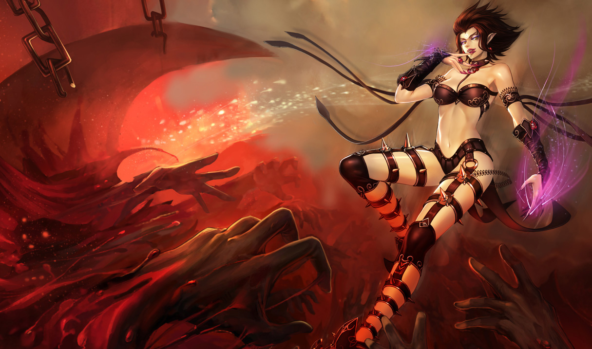
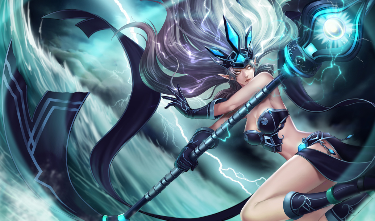
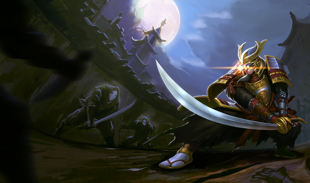
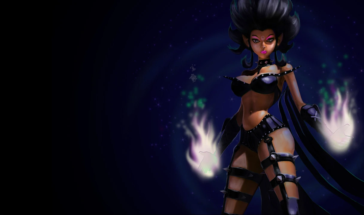
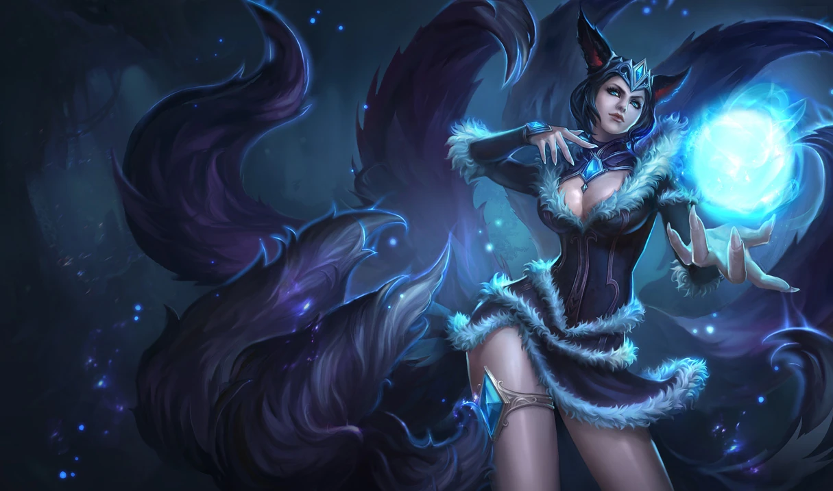
Once again, we have good, if somewhat aged splash arts being replaced by obviously subpar, cheap, expressionless and overall bland Chinese artwork, some of which is absolutely appallingly generic to the point you would have a hard time of recognizing the character for what it is ingame. Many of my favorite splash arts are getting replaced with things I would pay money not to see, but the one that hurts the most is another splash by KNKL - the maker of the old Blood Moon Akali, Redeemed Riven, and several other ones that single-handedly made me want the skins - the Midnight Ahri one. It is a great example of just how unnecessary and destructive the change is. For comparison, this is the new artwork and this is the old one. The obviously failed attempt to mesh the new one's style with the old one aside - the whole mysticism, expression, feeling of the old art is gone, replaced by the usual bland, expressionless dollface so typical of cheap, and I underline, cheap Chinese art pieces. There are many great Chinese artists and art pieces, and I did not see a single good one that is at all representative of League's artstyle among the new ones. Hell, just look at the new Karma ones, and you'll probably want to cry too.

Riot Art Team. I have great respect for you. I am not expecting a response, but please. As a professional artist myself, please answer me, and give me one good reason to replace current good-looking art, even if slightly aged, with what we seem to be getting soon. Do you honestly believe that those "new" splash arts are representative of League's style and feeling? I fully understand the need to unify splash arts between regions, and support it. But why replace the GOOD Western art with the BAD Eastern art? If it was good Eastern art, I would have nothing against it - I do not want to turn this into a regional difference issue. But from an artistic standpoint, those pieces have absolutely nothing to offer over most of the current ones besides questionably higher resolution. And resolution is far from anything. It pains me to see good art go to waste and be forgotten, just to be replaced with cheap imitations or pieces that lack even the slightest glint of the expressiveness, feeling and emotions shown in ones we have.

You can do better than this. I know you can, because you have.

93 Comments

yay nibbers33 votes

Yo if you have a problem with the Ahri splashes, that's cool. I kinda agree that they're pretty unnecessary, it's literally just face changes. But a lot of the Chinese art is really cool and are perfectly good pieces. You can't just link the Ahri face change and say that all the Chinese art is equally lame. Here's some good ones for example, that all are just as good if not improvements over the originals: https://2.bp.blogspot.com/--8Kxq4gvKac/VvWrdnPfm7I/AAAAAAAAMp8/-oy_KSSQELI_wNL9ENfjWgjGyJaC36gow/s1600/MissFortune_Splash_5.jpg https://2.bp.blogspot.com/-UkPE3_XFh44/VvWrda65XbI/AAAAAAAAMqA/lJjW8PVpgRgxUvFkr9Zi1vSCO9wsfNEng/s1600/MissFortune_Splash_3.jpg https://3.bp.blogspot.com/-V9Fvgql4GDw/VvWrXsoKbhI/AAAAAAAAMn4/y2oGLtQpZ0Qz8foeee0IMnqIP4T2WU_gA/s1600/Akali_Splash_6.jpg https://1.bp.blogspot.com/-e1ketrNSkPE/VvWrXRYby_I/AAAAAAAAMn0/ZjXEGq0yFWMNhhyBKvVHqdqLFgs6Pdi8A/s1600/Akali_Splash_2.jpg https://4.bp.blogspot.com/-uDrZZPuQMpY/VvWrX2wKEDI/AAAAAAAAMn8/6ThCpjB8GskN30Xm6pFbXFrxyWPpyhCDw/s1600/Alistar_Splash_4.jpg https://1.bp.blogspot.com/-8ViplORhINE/VvWraEjJMKI/AAAAAAAAMow/_d0if8DF1UsE6EWo_14WRRDOcqqYL2xfw/s1600/Evelynn_Splash_1.jpg https://4.bp.blogspot.com/-iQ_XrKlOCpo/VvWrbu8RVpI/AAAAAAAAMpQ/HWMRqOMOmGUVBDFwdpSx5M6Oisff6uS0Q/s1600/Janna_Splash_1.jpg https://1.bp.blogspot.com/-k6CXLykldCw/VvWrc-5pq-I/AAAAAAAAMps/_-W31_DyMQYnthrQDUIN3pdGoXHc8gq6g/s1600/MasterYi_Splash_4.jpg That's all just from the current batch on the PBE and it's not even all the good ones.

Compare them to some of the current splashes: http://vignette3.wikia.nocookie.net/leagueoflegends/images/9/9c/Akali_SilverfangSkin.jpg/revision/20160325210318 http://vignette1.wikia.nocookie.net/leagueoflegends/images/8/8f/Evelynn_ShadowSkin.jpg/revision/20160325224005 http://vignette3.wikia.nocookie.net/leagueoflegends/images/5/52/Janna_TempestSkin.jpg/revision/20160326005313 I know taste is subjective, but the Chinese ones are way better than these.

You can't just go cherry picking and making blanket statements about the other splashes. Yes, some are pretty lame. The Fiora splash is particularly lame compared to the current. But to say they're all just as bad is just wrong.

The Loli Support7 votes

[{quoted}](name=Ron Pitts,realm=NA,application-id=6kFXY1kR,discussion-id=76UrXhlJ,comment-id=0008,timestamp=2016-03-26T20:05:37.960+0000)

Yo if you have a problem with the Ahri splashes, that's cool. I kinda agree that they're pretty unnecessary, it's literally just face changes. But a lot of the Chinese art is really cool and are perfectly good pieces. You can't just link the Ahri face change and say that all the Chinese art is equally lame. Here's some good ones for example, that all are just as good if not improvements over the originals: https://2.bp.blogspot.com/--8Kxq4gvKac/VvWrdnPfm7I/AAAAAAAAMp8/-oy_KSSQELI_wNL9ENfjWgjGyJaC36gow/s1600/MissFortune_Splash_5.jpg https://2.bp.blogspot.com/-UkPE3_XFh44/VvWrda65XbI/AAAAAAAAMqA/lJjW8PVpgRgxUvFkr9Zi1vSCO9wsfNEng/s1600/MissFortune_Splash_3.jpg https://3.bp.blogspot.com/-V9Fvgql4GDw/VvWrXsoKbhI/AAAAAAAAMn4/y2oGLtQpZ0Qz8foeee0IMnqIP4T2WU_gA/s1600/Akali_Splash_6.jpg https://1.bp.blogspot.com/-e1ketrNSkPE/VvWrXRYby_I/AAAAAAAAMn0/ZjXEGq0yFWMNhhyBKvVHqdqLFgs6Pdi8A/s1600/Akali_Splash_2.jpg https://4.bp.blogspot.com/-uDrZZPuQMpY/VvWrX2wKEDI/AAAAAAAAMn8/6ThCpjB8GskN30Xm6pFbXFrxyWPpyhCDw/s1600/Alistar_Splash_4.jpg https://1.bp.blogspot.com/-8ViplORhINE/VvWraEjJMKI/AAAAAAAAMow/_d0if8DF1UsE6EWo_14WRRDOcqqYL2xfw/s1600/Evelynn_Splash_1.jpg https://4.bp.blogspot.com/-iQ_XrKlOCpo/VvWrbu8RVpI/AAAAAAAAMpQ/HWMRqOMOmGUVBDFwdpSx5M6Oisff6uS0Q/s1600/Janna_Splash_1.jpg https://1.bp.blogspot.com/-k6CXLykldCw/VvWrc-5pq-I/AAAAAAAAMps/_-W31_DyMQYnthrQDUIN3pdGoXHc8gq6g/s1600/MasterYi_Splash_4.jpg That's all just from the current batch on the PBE and it's not even all the good ones.

Compare them to some of the current splashes: http://vignette3.wikia.nocookie.net/leagueoflegends/images/9/9c/Akali_SilverfangSkin.jpg/revision/20160325210318 http://vignette1.wikia.nocookie.net/leagueoflegends/images/8/8f/Evelynn_ShadowSkin.jpg/revision/20160325224005 http://vignette3.wikia.nocookie.net/leagueoflegends/images/5/52/Janna_TempestSkin.jpg/revision/20160326005313 I know taste is subjective, but the Chinese ones are way better than these.

You can't just go cherry picking and making blanket statements about the other splashes. Yes, some are pretty lame. The Fiora splash is particularly lame compared to the current. But to say they're all just as bad is just wrong.

Compared to the Janna and Evelynn ones, the "new" ones are somewhat an improvement, yes. I disagree about the Akali one, however.

The problem is that while the new ones certainly have higher definition in most cases, definition is not the only way to judge a picture's quality. The Akali one has far more character in it, from pose, to expression, to background. The artstyle is also much more alike to the League one. The new one suffers from the usual lack of expressiveness.

Don't get me started on the new Blood Moon Akali - Again, it is higher definition, but as a picture it lacks any sort of character or feeling. It's just dry. So are the MF ones. Alistar doesnt look like a benevolent cow that smashes things now, but he looks like a rampaging, mindless bull. Which is not his character. MF and Janna ones - Sure, they are higher image quality, but once again lack any sort of feeling to them. They look generic pictures of anime girls dressed up to look like the champions, rather than the champions themselves.

yay nibbers19 votes

First of all, that's Crimson Akali, not Blood Moon Akali. You're so up in arms about that one in particular but you don't even know which skin it is. On that note, here's the current Crimson Akali splash and the new one: http://vignette2.wikia.nocookie.net/leagueoflegends/images/6/65/Akali_CrimsonSkin.jpg/revision/20160325210204 http://vignette2.wikia.nocookie.net/leagueoflegends/images/6/65/Akali_CrimsonSkin.jpg/revision/latest?cb=20160325210205 Tell me which one is more "expressive," the one with the straight face swinging her kama at nothing in a generic dojo looking background (because she's a ninja, right) or the one where she's in some dark underworld or something holding some demonic looking head with blood dripping out? There's an actual setting and atmosphere in the 'new' splash. If anything, the old one is more generic anime ninja than the new one, a thing you yourself complain about (which is a load of bull by the way, more below).

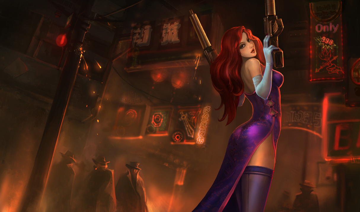
Secret Agent Miss Fortune: http://vignette1.wikia.nocookie.net/leagueoflegends/images/5/5f/Miss_Fortune_SecretAgentSkin.jpg/revision/20160326011229 https://2.bp.blogspot.com/-UkPE3_XFh44/VvWrda65XbI/AAAAAAAAMqA/lJjW8PVpgRgxUvFkr9Zi1vSCO9wsfNEng/s1600/MissFortune_Splash_3.jpg Angry lady who shot up some dudes and a table in a strangely foggy bar or a confident armed lady own in the shady part of town getting the stink eye from some suspicious fellows? I'll hand it to you on this one, the old one is actually pretty decent if not a little boring to look at (there's literally nothing going on in two thirds of the image). That's a big thing though, the image is boring compared to the Chinese one. You can cut out more than half of the image and get the same scene. As far as expression goes though, the only real difference is one is angry and one isn't. I assume that's really what you're on about when you talk about how expressive they are, but to that I say "so what?" People don't have to have to wear a particularly strong emotion at all times. There's more to people than just angry.

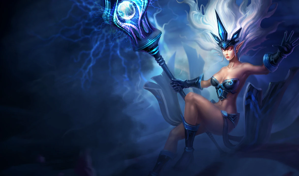
How about the Janna splashes?: http://vignette3.wikia.nocookie.net/leagueoflegends/images/5/52/Janna_TempestSkin.jpg/revision/20160326005313 https://4.bp.blogspot.com/-iQ_XrKlOCpo/VvWrbu8RVpI/AAAAAAAAMpQ/HWMRqOMOmGUVBDFwdpSx5M6Oisff6uS0Q/s1600/Janna_Splash_1.jpg Woman floating around in a foggy void weilding some zappy staff or a woman soaring high in the clouds clearly brewing up a storm? What does the old one have that the new one doesn't have and then some? The old one is boring, has nothing going on, and Janna looks so bored. At least in the new one she's doing something. As far as facial expression goes, they both are wearing a straight face. Here we have to look to their body for expression, and here is where the old splash falls flat. As mentioned, she looks almost bored and isn't really doing much of anything other than float there. This is more expressive in your eyes?

These are just three that you yourself mentioned. I could do more, but for the sake of brevity I won't here. You can compare them yourself if you like.

Regarding the style, to say they all look like generic anime girls really demonstrates how much you actually looked at them (that is to say, barely if at all). Just because they are done in the same, but different to our own, style that does not make them generic. That is just insulting to the artists. They're filled with detail and expression that clearly you're missing, either due to your bias or maybe you're just blind, and to say that they're all bad because one or two are bad is absolutely ridiculous. Yes, some of them are bad, but most of them are at the very least as good if not better than the splash arts they are replacing. All of them are still very clearly the champions they are meant to depict, they have all their defining features and recognizable. The art quality is almost universally better, with better anatomy, better detail, and better scenes.

TL;DR: Most of what you're saying is a load of shit. If you don't like the Chinese splashes' style, that's your opinion and you're free to have it. To say that they're objectively worse however, is just wrong. If you honestly think most of them are somehow less expressive than the current ones, you need to get your eyes checked.

The Loli Support5 votes

[{quoted}](name=Ron Pitts,realm=NA,application-id=6kFXY1kR,discussion-id=76UrXhlJ,comment-id=000800000000,timestamp=2016-03-26T23:26:58.112+0000)

First of all, that's Crimson Akali, not Blood Moon Akali. You're so up in arms about that one in particular but you don't even know which skin it is. On that note, here's the current Crimson Akali splash and the new one: http://vignette2.wikia.nocookie.net/leagueoflegends/images/6/65/Akali_CrimsonSkin.jpg/revision/20160325210204 http://vignette2.wikia.nocookie.net/leagueoflegends/images/6/65/Akali_CrimsonSkin.jpg/revision/latest?cb=20160325210205 Tell me which one is more "expressive," the one with the straight face swinging her kama at nothing in a generic dojo looking background (because she's a ninja, right) or the one where she's in some dark underworld or something holding some demonic looking head with blood dripping out? There's an actual setting and atmosphere in the 'new' splash. If anything, the old one is more generic anime ninja than the new one, a thing you yourself complain about (which is a load of bull by the way, more below).

Secret Agent Miss Fortune: http://vignette1.wikia.nocookie.net/leagueoflegends/images/5/5f/Miss_Fortune_SecretAgentSkin.jpg/revision/20160326011229 https://2.bp.blogspot.com/-UkPE3_XFh44/VvWrda65XbI/AAAAAAAAMqA/lJjW8PVpgRgxUvFkr9Zi1vSCO9wsfNEng/s1600/MissFortune_Splash_3.jpg Angry lady who shot up some dudes and a table in a strangely foggy bar or a confident armed lady own in the shady part of town getting the stink eye from some suspicious fellows? I'll hand it to you on this one, the old one is actually pretty decent if not a little boring to look at (there's literally nothing going on in two thirds of the image). That's a big thing though, the image is boring compared to the Chinese one. You can cut out more than half of the image and get the same scene. As far as expression goes though, the only real difference is one is angry and one isn't. I assume that's really what you're on about when you talk about how expressive they are, but to that I say "so what?" People don't have to have to wear a particularly strong emotion at all times. There's more to people than just angry.

How about the Janna splashes?: http://vignette3.wikia.nocookie.net/leagueoflegends/images/5/52/Janna_TempestSkin.jpg/revision/20160326005313 https://4.bp.blogspot.com/-iQ_XrKlOCpo/VvWrbu8RVpI/AAAAAAAAMpQ/HWMRqOMOmGUVBDFwdpSx5M6Oisff6uS0Q/s1600/Janna_Splash_1.jpg Woman floating around in a foggy void weilding some zappy staff or a woman soaring high in the clouds clearly brewing up a storm? What does the old one have that the new one doesn't have and then some? The old one is boring, has nothing going on, and Janna looks so bored. At least in the new one she's doing something. As far as facial expression goes, they both are wearing a straight face. Here we have to look to their body for expression, and here is where the old splash falls flat. As mentioned, she looks almost bored and isn't really doing much of anything other than float there. This is more expressive in your eyes?

These are just three that you yourself mentioned. I could do more, but for the sake of brevity I won't here. You can compare them yourself if you like.

Regarding the style, to say they all look like generic anime girls really demonstrates how much you actually looked at them (that is to say, barely if at all). Just because they are done in the same, but different to our own, style that does not make them generic. That is just insulting to the artists. They're filled with detail and expression that clearly you're missing, either due to your bias or maybe you're just blind, and to say that they're all bad because one or two are bad is absolutely ridiculous. Yes, some of them are bad, but most of them are at the very least as good if not better than the splash arts they are replacing. All of them are still very clearly the champions they are meant to depict, they have all their defining features and recognizable. The art quality is almost universally better, with better anatomy, better detail, and better scenes.

TL;DR: Most of what you're saying is a load of shit. If you don't like the Chinese splashes' style, that's your opinion and you're free to have it. To say that they're objectively worse however, is just wrong. If you honestly think most of them are somehow less expressive than the current ones, you need to get your eyes checked.

Since I'm pretty tired to make a prolonged post, I will try to keep it short. While I don't quite appreciate your tone, I do appreciate the work you put in your post.

On Akali: First, thank you for pointing it out. I genuinely did not realize that splash art was Crimson Akali, and not Blood Moon Akali. Which, by the way, is a pretty damn big problem on its own.

The MF splashes I am somewhat torn on. While there is a lot to be desired there, the new splashes aren't bad on their own. The faces are practically the same, although on its own I would say that the Secret Agent one is one of the few that are an improvement. On emotion - The problem isn't that she's not angry. It's that she's hardly showing much emotion, but I can accept that there is a certain attempt at a look of seductiveness. I will give this one to you.

Now for Janna: While the art is definitely dated and can be a lot better, it has dynamic. It has expression. The facial and body proportions are consistent with other Janna splash arts. The Chinese one is pure anime face and the flawless figure. The long, elfish face has been consistent along Janna splashes - we do not see this in the Chinese one, which again, is a completely generic anime face. Her body type is the same - compare it to the earlier Crimson Akali one, and they are but identical. In the old Janna one, the spiky hair speaks "Tempest" far better than the gently flowing one in the Chinese piece. The background might be more "obviously" accurate, sure. But ask any serious artist, and they will tell you the true art is in the subtle things, not the obvious ones.

This is not about not liking Chinese art, because real Chinese art is in many ways different but also better than Western art. There are some amazing pieces of both Eastern and Western ones. I gave my opinion as an artist who has been studying League splashes for a long time, since they were doing the Art Spotlights, and following League artists to study how they approach different champions. I appreciate League art a lot, because the visual style is vibrant, deep, and in many cases, even those splash arts that eventually get scrapped, like an Ezrael one sometime ago, show levels of expression, dynamic and overall feel of both character and background that I've seen matched in a few other games. Which is exactly why I am so upset to see those splash arts that while I admit are dated, are still very, very good pieces, even if not in the HD quality of newer ones, be replaced with ones that are not only not better, but take away from the identity of characters, are bland and overall uninteresting. Sure, they may be more refined. But that does not make them better on its own.

Choaru10 votes

said you were gonna make it short lul

Caitlyn Hunt2 votes

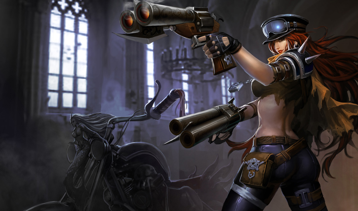
road warrior mf's new one is meh. everyone liked her old splash even if its low quality. and shadow eve's is nice but im hoping they give her a tan like both karma skins, to fit the model. that janna and secret agent mf are one of the best ones. and all of the yi ones.

yay nibbers1 votes

I'm personally really torn on Road Warrior MF. They're both great imo but have totally different feels about them. The current one feels like Mad Max or something while the new one seems more like something out of Devil May Cry. I'm fairly certain that DMC is not what they were going for when they made the skin so long ago, but the new splash is cool nonetheless. It'll be sad seeing the current one go though.

The Janna one is easily the best in the bunch.

Caitlyn Hunt1 votes

yup

scoot14 votes

Honestly, I'm pretty displeased with a lot of the decisions Riot has been making lately in regards to story for champions (re: Diana and Leona) as well as art. I'm all for using the same art on all things, but when they get really awesome art, like Poppy Poppy's art or Annie Annie's newer default NA splash, and replace it with what they're doing with Sanguine Garen's new art? It just feels bad.

I mean, don't get me wrong, the previous artwork on Sanguine Garen could use updating to match the new style that League had been going for as of late, but to replace it with something that's basically of (in my opinion as a player and as an artist) lower quality seems like a really bad decision. Riot wants the excitement of "Oh yeah, new art!" but they're just recycling older art that has a lot of problems in it to begin with. In the new Sanguine Garen skin, the perspective is waay off. It reminds me of the original character art that they used to have. Like Evelynn's old splash art (like the art used on the old version of Shadow Evelynn)

I don't think ALL of the eastern art is bad-- take the new art for Masquerade Evelynn and Shadow Evelynn. Both of those are exponentially better than what was previously used.

But to take something that isn't super great as it is and to replace it with something of equally not-so-great quality seems like a cheap way of Riot trying to cut corners and not have to actually purchase art that's of the same quality as some of the newer skins.

On to the matter of the new Midnight Ahri splash: I do think that this art could use updating to match the new style of League's art, but what they've done seems REALLY shady of a thing to do. It looks like they just photoshopped a different head onto the already existing art. It doesn't look "better" this way. I don't think the new head itself is bad on its OWN, but with this whole piece, it looks really horribly done.

Riot, I know you want to make as much money as possible, and a lot of the easiest way to do that is to cut corners with stuff like this instead of purchasing/paying artists to make new versions, but COME ON. That head doesn't even match the rest of the style of that picture! Maybe you're thinking "oh, someone that isn't an artist won't notice" or something, but it's PAINFUL to look at.

All in all, I agree with OP's displeasure. I'm really losing faith in Riot nowadays, so I guess I should have expected them to cut corners and do cheap things like this instead of investing in actual good art for characters whose art needs updating.

kDrakari3 votes

I've heard very mixed opinions on Masquerade Evelynn. Personally, I wouldn't call the Chinese one a great splash, but it's at least more visually interesting and distinct than the current one, with neither really able to convey anything about what the skin is supposed to be.

There are quite a few that could probably be considered a downgrade to varying degrees: a few that are just small changes to a face for... some reason, all the way up to Nightraven Fiora which is replacing a great and modern splash art with a horrible and boring thing that has a lot more in common with the splashes we're trying to get rid of than the ones that we're supposed to be replacing them with.

My biggest complaint is Sun Goddess Karma, which I have already complained about a lot in various threads so I'll just leave it at that.

Star Guardían5 votes

These changes are only to unify the splash arts in the short term. It's not like they're going to keep them forever. Eventually they'll all get updated. It's most likely financially impossible for them to hire more artists in the short term. Doing so is a huge undertaking and isn't easy as 123. So it isn't really fair to say Riot is cutting corners when you don't have the full story.

Also, Diana and Leona's new lore is an improvement over the old lore in my opinion.

ModAcademy Kayn3 votes

What people seem to forget, or not think about, is how Leona would've react if she saw Diana kill the elders in the previous lore. IF she was actually there, and not off at the League, do people really think Leona would've been all "Oh that's alright, they were old anyways"?

Star Guardían1 votes

That was not Leona's reaction at all. She went days searching for Diana to seek vengeance.

ModAcademy Kayn2 votes

I meant the Old Lore, before the aspects. Diana's lore during that time was while Leona was away at the League, so if Leona had been there, when Diana slaughtered the elders, what would've she done in the old lore, according to everyone else.

JackMcSnipeyz9 votes

I must add, the new caitlyn safari and arctic warfare are also both terrible. Safari caitlyn looked classy and polite, and had actual safari in her picture. New one is just generic, big boob, smooth legs girl with a sniper, next to a waterfall? Its so bad i consider not using it anymore.

Maratsune8 votes

Yeah, the change to Arctic Warfare annoys me. It was a fairly classy in-action depiction before, and now she's posing beside a tank. Definitely not an improvement in my book.

Bladerunner77778 votes

I agree

The Chinese Infiltrator Irelia splash art looks decent: http://i.imgur.com/DLEy85L.jpg

But she looks like she's modeling. The current infiltrator Irelia is a snapshot of the action; like Irelia is actually infiltrating something. Chinese splash looks like she's being abducted by aliens. I would prefer an interesting low res splash instead of a boring high res splash.

Current splash btw: https://i.ytimg.com/vi/sSlNApr_DKI/maxresdefault.jpg

xVaseFullofAcidx8 votes

Im just gonna bring this splash art that we will be getting. And this is one of my favorite skins now I will probably never use this skin again.

http://i.imgur.com/JDuLqoD.jpg[/img]

Maratsune6 votes

The Karma skins are ones that I can only just plead for Riot to not change. I mean, for the Sun Goddess one neither of them are ideal, but the Sakura one is just insulting. The glowing blue fans, the dark green kimono, the ANIME. I just... I really, really don't like it. And it's one of my favourite Karma skins to use. Please please please Riot.

H4C1lM1aRJ6 votes

I personally really like the new Ahri splashes for Midnight and Dynasty. I never really liked Dynasty Ahri's face (I mean it was okay; just never was a huge fan of it :P ). Midnight Ahri's face was fine in the original. But to each their own.

Solitair6 votes

You people have zero understanding or ability to percieve any manner of art. The great "fiasco" of the midnight ahri splash is literally just giving her a higher quality face. That is the only change. Her face is still dead-eyed and expressionless in the old splash. No special something has been lost, simply, a low-budget fix has been applied to a lower-budget splash. I really don't understand this misguided waifu-overprotectiveness.

Meep Man5 votes

That new splash is pretty decent. The old one didnt have all that many details in the face, the new one just makes it look more similar to her current base splash really. Not much else.

The Loli Support2 votes

[{quoted}](name=Inept Maverick,realm=NA,application-id=6kFXY1kR,discussion-id=76UrXhlJ,comment-id=0002,timestamp=2016-03-26T18:49:28.209+0000)

That new splash is pretty decent. The old one didnt have all that many details in the face, the new one just makes it look more similar to her current base splash really. Not much else.

Detail wise, yes, it is "better" if by better we assume that means higher definition. However, the face is absolutely generic - from facial structure to expression, you can literally put it on any other female's picture and it will look fine. That is unfortunately something that is prominent in the style of a lot of these "new" splashes - although this one isn't as bad as others, it is something regretful to do with a splash that currently shows a face with a lot more mystery to it, despite lower resolution.

Bret Hitman Hart5 votes

All of Karthus's Chinese splash arts are worse than his NA ones just because the Chinese have that taboo about skeletons. Skeletons are cool. Sorry China.

I definitely agree with the OP about most of his grievances. What's funniest to me about this whole situation is that the worst NA splash art of them all (Classic Warwick) could have been replaced by the far superior Chinese one, but nah. Just replace all the good skeletal Karthus art and debatably better MF, Akali, Irelia art. A shame.

Pledgie4 votes

i do have to say one thing about the midnight ahri thing tho. her new face does look a LOT more like the updated base splash, which was more cat like, with the eyes.

Jari2 votes

If it's more cat like instead of fox like, isn't that bad?

Or is she a cat now.

Keevalroy6 votes

When you think about the last several versions of Ahri Riot put out through the new base splashes, the cinematic, the statute, etc, I just assume they don't know what she looks like anymore so sure, she might as well be a cat at this point.

Caitlyn Hunt1 votes

they changed midnight/dynasty to actually look like her.

Keevalroy4 votes

They changed those splashes to make her face look like the ugly base, when that's the one that should have been changed. What's the point in changing every splash to resemble the one that has the issues when it could be fixed instead?

http://pre07.deviantart.net/ffe9/th/pre/f/2012/016/e/8/lol___ahri_by_knockwurst-d4mlo2a.jpg

This is what Ahri looks like.

Not this

http://1.bp.blogspot.com/-RWZ5vd0odwk/VJIo2K7o2fI/AAAAAAAAgPQ/wxGFh2n5Fk8/s1600/Ahri_Splash_0.jpg

The Loli Support2 votes

{quoted}

They changed those splashes to make her face look like the ugly base, when that's the one that should have been changed. What's the point in changing every splash to resemble the one that has the issues when it could be fixed instead?

http://pre07.deviantart.net/ffe9/th/pre/f/2012/016/e/8/lol___ahri_by_knockwurst-d4mlo2a.jpg

This is what Ahri looks like.

Not this

http://1.bp.blogspot.com/-RWZ5vd0odwk/VJIo2K7o2fI/AAAAAAAAgPQ/wxGFh2n5Fk8/s1600/Ahri_Splash_0.jpg

Agreed, though a lot of people seem not to share the opinion. Which is a bit odd to me, but to each their own.

LoL Ergo Urgot4 votes

Reaper Karthus doesn't even resemble Karth.

GreenLore4 votes

While I agree that some of the chinese arts aren't that good,I feel its really odd how you complain about midnight ahri out of all of them.

I mean not only is the change rather small,but the "dull face" as you describe it looks more mystical to me than the old one(the old one looks a bit like she isn't paying attention,which overall makes it kinda derpy for me).

Amoc1 votes

Personally I thought the Ahri changes were some of the "good" ones. I liked Akali as well. Most of the rest I didn't care for but some of them I was indifferent to.

Keevalroy2 votes

Making her face as ugly as the new base is an improvement?

AntiSkillshot4 votes

Uhm... you do realize that the Ahri splash you showed isn't even the Chinese one, right?

THIS is the Chinese Midnight Ahri splash. http://vignette3.wikia.nocookie.net/leagueoflegends/images/2/22/Ahri_MidnightSkin_Ch.jpg/revision/latest?cb=20121128190021

And thank God we're not getting that... thing...

The Loli Support1 votes

{quoted}

Uhm... you do realize that the Ahri splash you showed isn't even the Chinese one, right?

THIS is the Chinese Midnight Ahri splash. http://vignette3.wikia.nocookie.net/leagueoflegends/images/2/22/Ahri_MidnightSkin_Ch.jpg/revision/latest?cb=20121128190021

And thank God we're not getting that... thing...

I was basing my post by what was shown on Surrender@20. Which was what I linked, from there. However, even the one you show has the same problem - generic body woman with the exact same proportions as the other "new" pieces, with a face that doesn't even come close to looking anything like Ahri does. Heck, they didn't even bother to add the whisker-like marks on her face that are one of her biggest identifiers.

And on Ahri in general - yes, the old splash arts for all skins were one with a more animalistic face - whether it was feline or not I won't delve into - but that was a part of her identity and charm - to show she's not quite human, but getting there. It's what made her unique on the font of other female champions, like Katarina's scar, Janna's elven features, etc. Not all champions have those, male or female - some are far more distinguishing by their hair, or other features, but when one does have some identifier like this, it does nothing for the character to remove it just so he picture would be a higher definition.

AntiSkillshot2 votes

[{quoted}](name=The Yordle Hero,realm=EUW,application-id=6kFXY1kR,discussion-id=76UrXhlJ,comment-id=001a0000,timestamp=2016-03-27T09:49:15.018+0000)

I was basing my post by what was shown on Surrender@20. Which was what I linked, from there. However, even the one you show has the same problem - generic body woman with the exact same proportions as the other "new" pieces, with a face that doesn't even come close to looking anything like Ahri does. Heck, they didn't even bother to add the whisker-like marks on her face that are one of her biggest identifiers.

And on Ahri in general - yes, the old splash arts for all skins were one with a more animalistic face - whether it was feline or not I won't delve into - but that was a part of her identity and charm - to show she's not quite human, but getting there. It's what made her unique on the font of other female champions, like Katarina's scar, Janna's elven features, etc. Not all champions have those, male or female - some are far more distinguishing by their hair, or other features, but when one does have some identifier like this, it does nothing for the character to remove it just so he picture would be a higher definition.

Uh... you may wanna look at the original Midnight Ahri, as her whisker-like marks aren't on that splash either...

http://vignette2.wikia.nocookie.net/leagueoflegends/images/7/75/Ahri_MidnightSkin_old.jpg/revision/latest?cb=20160326033656

So, you complaining about the lack of them on the new splash makes no fucking sense, as the original didn't even have them in the first place. Actually, the whisher-like marks ARE in the new splash, just look close enough. I can see them clear as fucking day...

And, no, the Chinese splash actually doesn't have the "exact same proportions as the other 'new' pieces". She kinda has a broken spine in the Chinese splash for one. For two, she has a leg that's shorter than the other. I say shorter, because her pelvis isn't at the right angle to suggest her legs are at even length.

On the note of "more animalistic face". What makes you think that Riot was even going for such a... face... in the first place? You are realizing we are talking about something that belongs to neither of us, right?

Sassmast3r3 votes

For me, if it's an already outdated splash itself, and they're simply changing it slightly to make it globally the same (even if it isn't an improvement), as long as it doesn't make the splash worse, then I genuinely do not care. Sun goddess Karma for example, doesn't look good right now, and the china one doesn't look much better, but they're both bad, so it doesn't bother me as much. Whereas, Night Raven Fiora's splash is beautiful, the chinese one is crap, and they're actually considering replacing it with the chinese one just for the sake of globalization, now that pisses me off. I don't recall a single person in the NA server saying "Gosh, I hate the NA splash arts, the chinese ones are so much better." Besides, if they did say that, my response is for them to then go play on the chinese server if they have a problem with it.

Maybe it's just me, but this seems like a subtle way of riot basically saying "It would take too much time to update all the old splash arts again, so we're trying to just globalize them and shift our focus to more "important" things." My response is no, finish what you've started. Don't let us see a piece of cake and not let us eat it, either don't update a single splash art ever, or update all of the ones that are clearly not up to your standard. I can deal with some of them being globalized if they aren't changing that much, but as long as this isn't just a workaround for Riot.

Caitlyn Hunt1 votes

alot of people asked for chinese splashes. 90% of it was for annie,sivir and trist tho.

Star Guardían3 votes

If you fully understand the need to unify slapshes across all regions you'd understand that this is the best compromise that can be made. Both NA and China are losing splashes they love. If this was put up for a vote I assure you the outcome would have been worse for us since there are far more Chinese players that could vote for their splash arts. So you kinda have to roll with the punches until they get updated. Besides you only ever see them for 1min during the loading screen and I doubt you own every skin and champion being replaced.

JacctheInsomniac3 votes

[deleted]

Amoc1 votes

Haha I like the way you put that. I don't agree they're all bad, but for most of them I think you're spot-on.

Celio Hogane HD3 votes

you did just put Ahri splash as an example.

You are trolling.

Keevalroy2 votes

Seeing so much hate for this decision makes me wonder how China is reacting to this. It seems like we want less than a fourth of them - I'm curious if they feel the same way about our splashes being forced on them.

TheySeeMeWardin1 votes

It does become a sticky situation with not wanting to step on anyone's toes and making both parties happy. My problem is why RIOT would allow a difference in champ and skin splashes? If a region has a problem with the game (ex. Karthus and Taric) then don't allow the game in that region. If the game has to abide by universal cultures then it loses its quality because it can't offend anyone (are we really going to shade out Karthus' face because it suggests bones....)

Kinjishi3 votes

"If a region has a problem with the game (ex. Karthus and Taric) then don't allow the game in that region." When you're majority owner (90% - Tencent) is based in China, this isn't an option.

joliesse2 votes

Two of the skins I own that I think the NA version do much better are Arctic Warfare Caitlyn and Exiled Morgana. Exiled Morgana really needed an update, but the Chinese version is a total downgrade!

Amoc2 votes

Exiled Morgana is my main skin for my main champion. I am not pleased with the anorexic, awkwardly posing junky they're replacing her with.

GhostOfShrimpmas1 votes

Are those two ahri links different? Near as I can tell, that's just the same art with slightly more black space on the far left of the background on one of them.

Jari2 votes

Look at the face.

More from Story, Art, & Sound

More by The Loli Support