Favorite Splash Art of all time? (Plus some old ones i think are awesome.)
Hey guys ,
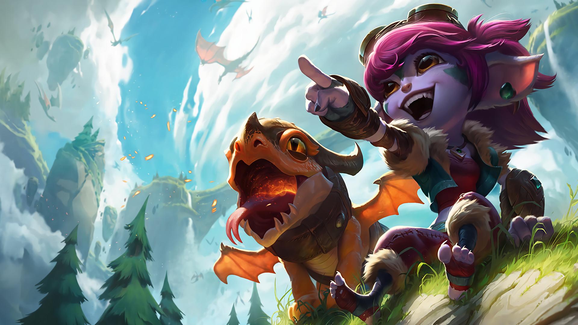
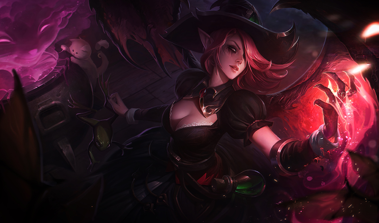
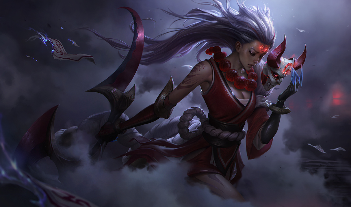
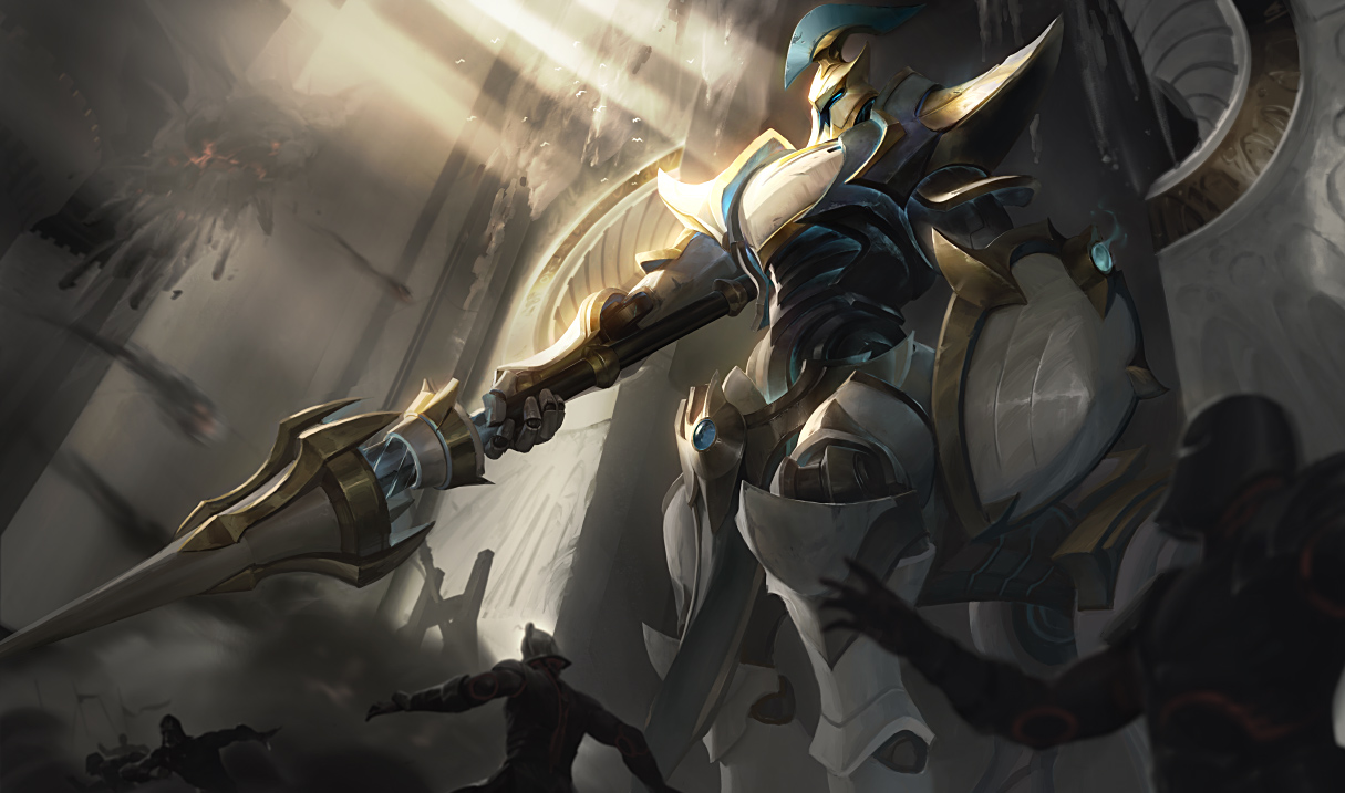
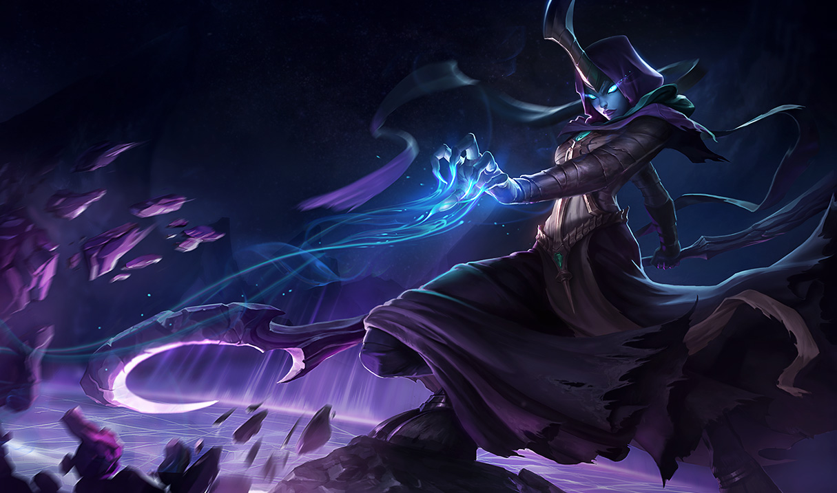
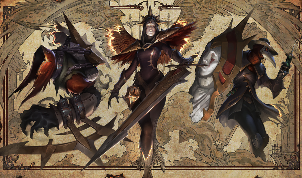
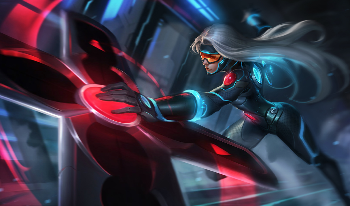
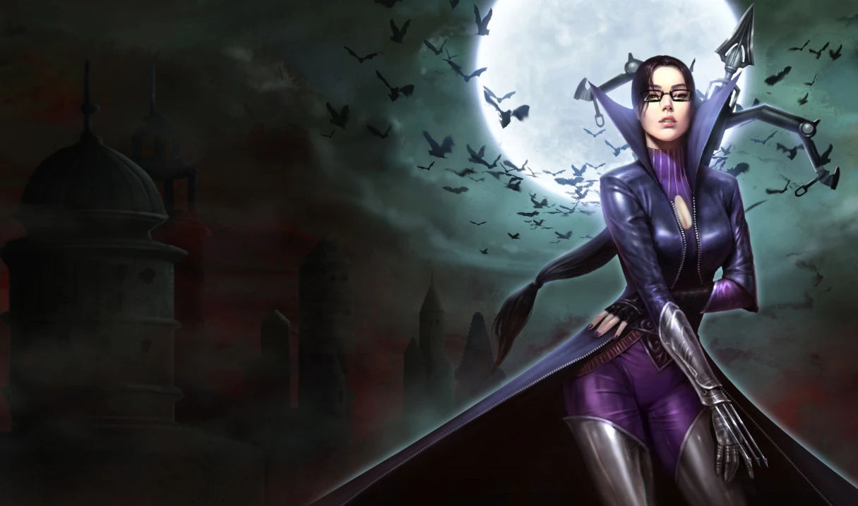
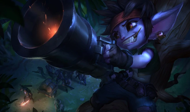
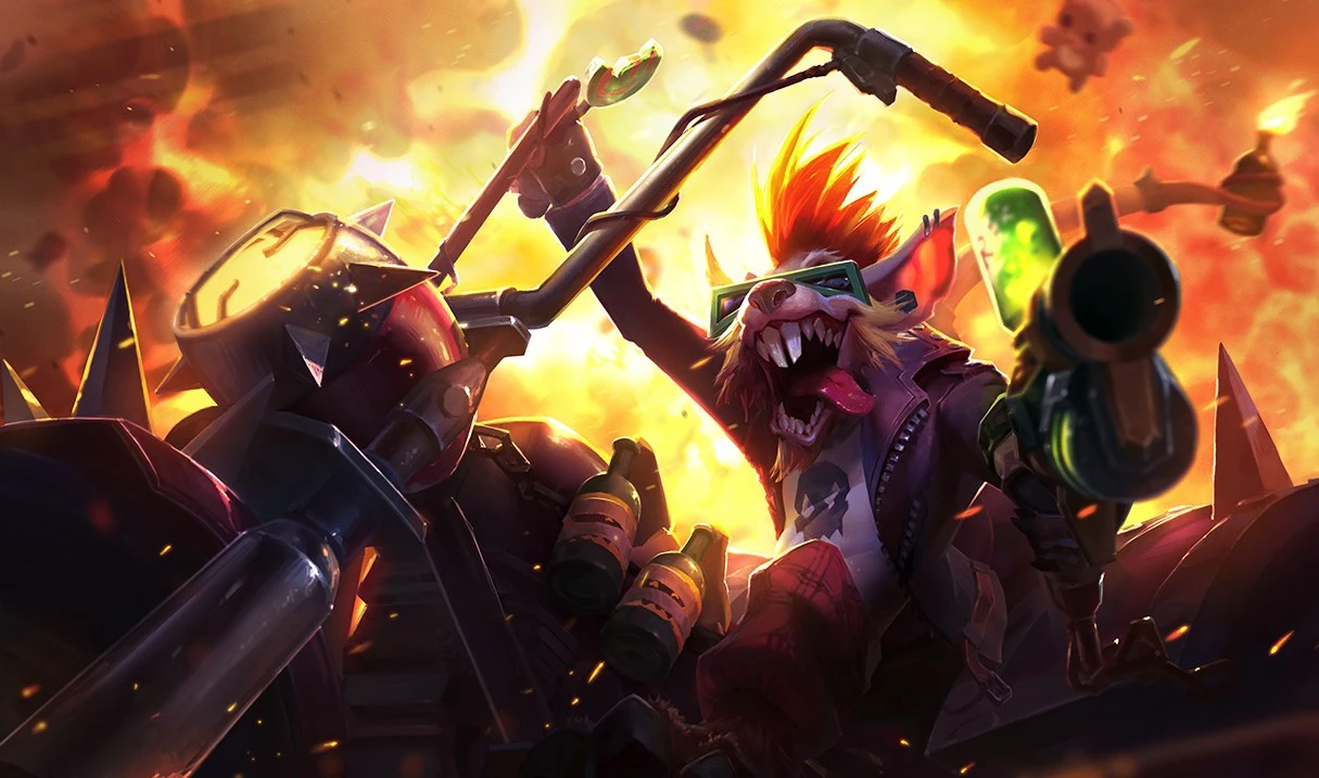
I'm really into skin splash arts. It usually will make or break if I buy a skin or not, and sometimes I'll buy skins just because of the splash, regardless of how it looks in game.
So I'm wondering, what is your all-time favorite skin splash art?
I think mine is http://imgur.com/RuV9TpA I mean he looks awesome and powerful and fearless. It's pretty simple design wise, but it works so well. I love it.
As a lover of the splash art, it really sucks when Riot changes them and makes them worse. I understand they are just modernizing it, and they look outdated or plain, but on some skins, I still love the old ones so much more. These are some skin splashes that I wish never got changed. (Note that the old splash pictures are made longer than usual, so pretend its the size of a loading screen box)
http://imgur.com/LAxlkzW http://imgur.com/qThrvgc The first one is SCARY , and that's how Annie should be.. a dark child who scares the shit out of you. The second one isn't completely awful, but it just doesn't fit a "goth Annie" to me. Like I said, Annie is supposed to make you feel uneasy, and a gothic one should make you plain scared. If I ever saw this skin being used by an Annie player, I knew I was going to die. lol
http://imgur.com/Zi8ctkw http://imgur.com/GAgsS2F The first one just looks cool. It's dark and mysterious , and I personally love the all black look. I wanted this skin so bad back in season 3-4 .. Now honestly, the splash killed it for me. It's just ugly and too cartoony and I really don't even want this skin anymore solely because of that. lol
http://imgur.com/0K4y9R9 http://imgur.com/x1yN0wi This one I can understand looks kind of plain, and might be confusing to some people why I liked this so much. I guess when I look at a splash art, I want it to be impactful in the loading screen , I mean it is the only time you'll see it . So this Ezreal skin just made him look like he means business and I loved the color scheme, his hand looks dope, the background looks dope, and I like his clothes. The new splash isn't bad, it's pretty much the same with more of a detailed graphic type of look , but it just doesn't give me the same vibe as the first one.
http://imgur.com/hKkfxbZ http://imgur.com/7eKCzYL I was actually really annoyed by this change... Warwick is a deadly werewolf who loves blood and hunting, someone you are supposed to run from when you see him. The first picture is absolutely perfect for this theme. The blood from his mouth and claws , the blue coming from his eye implying that he's in hunt mode, zoned in on his prey. The fur, the background, it all goes so well together. Then you got the second one. Some people might like it, idk .. I find it really ugly. Ears are too long, bottom of mouth is a different color, making it look like he's wearing a costume or something.. and imo just way too white.
http://imgur.com/AQOMzMe http://imgur.com/5sF2dw8 But to end this on a good note, Thank you so much for this change Riot!!!! Finally our beautiful Nidalee doesn't look like a man anymore!!



























/cdn.vox-cdn.com/uploads/chorus_asset/file/8636383/18836716_1432258293487797_6045970629852047100_o.jpg)










:format(webp)/cdn.vox-cdn.com/uploads/chorus_image/image/54324371/da4b76c4f7b9ddbd.1492546657.jpg)
