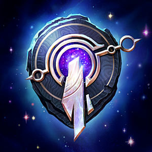
[Art] Updated Summoner Icons
Zkaiser·12/17/2014, 12:24:42 AM·3 votes·12,598 views

15 Comments

1st HanarSpectre12/17/2014, 12:28:11 AM7 votes

New ones look better to me.

Saruyan12/17/2014, 12:27:47 AM6 votes

explain to me how they are ruined?

LANWhale12/17/2014, 2:19:13 AM4 votes

IF THEY DARE TOUCH MY WRAITHS ICON. LORD HAVE MERCY ON THEM! Lost but not forgotten, Wraiths 2011-2014.

Ebonmaw Dragon12/17/2014, 12:27:34 AM3 votes

Riot please, keep the Lizard... dont change him for that weird red thing and keep the purple minons... at least for "legacy" icons

The Legend Momo12/17/2014, 12:36:43 AM3 votes

These look amazing man, I don't know what you're talking about. Good job Riot!

GreenLore12/17/2014, 12:36:11 AM2 votes

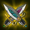
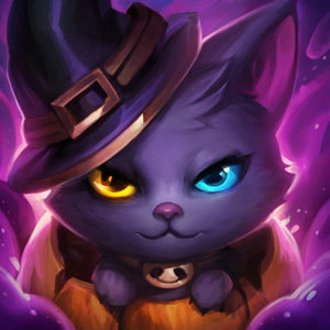
The rose looks definetly better now and the leaf looks great too.

The tibbers is debateable,but at least he now looks like tibbers

The paw really looks kinda bland,it is simply the paw of a bear,kinda lame

Forbidden Siren12/17/2014, 4:46:29 PM1 votes

I like them. I never liked the old/default icons.

Sukishoo12/21/2014, 3:15:12 AM1 votes

They all look SOOOOOOOO much better. You are absolutely out of your mind if you don't like the updates.

Willowmancy1/24/2015, 5:48:37 AM1 votes

The new ones look like horse shit, I feel so betrayed honestly, why did they have to change the bear claw of all things? :( Riot needs to stop changing shit, instead they should just add new content rather than changing old content.

Elphrihaim1/24/2015, 8:00:56 PM1 votes

I like the old ones more than the new ones

Just because of how iconic they are

It's like Riot saying "Well, we don't really like Garen as he is, so we're remaking every single part of him"? :V

Beerstein1/24/2015, 8:08:20 PM1 votes

Bear is worse, paws both suck, the other two are improvements. If they kept the concept on the bear with updated art it'd be fine, went from angry bear to that? Ick.