Is anyone else not digging the increasing minimalism in the cilent

gatchi·8/5/2016, 2:44:11 AM·2 votes·946 views

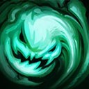
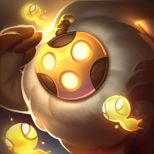
You have some great colors and patterns but i just feel like it doesnt showcase because there isnt the contrast that used to be. I feel like with every update everything feels more crowded, bland, flat, and cheap. A lot of shit (not just in the client but in cover art) is one color. Im sure there are people who like it but..... am i alone here?
2 Comments

Rude Name8/5/2016, 6:57:50 AM1 votes

You're being quite harsh about it all, but something definitely is ... off about the new client. Sure, it functions better, is more coherent, and yet the current one, in all it's hodge-podge glory, just feels more comfortable.

I agree for sure, there does need to be more contrast. I kind of miss the old Summoners Rift, because that was also heavily contrasting, and quite intense and vibrant. It seems Riot is eliminating all these designs in favour for newer ones, but I'm beginning to miss some of the old art style.

Meep Man8/5/2016, 6:15:22 PM1 votes

I am very confused about what you are talking about. Can you provide images for a side by side comparison here and explain from there what you are talking about in detail?