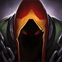
That's pretty cool, neat to see stuff like this by the community.
That said - it has a lot of things you could improve on.
His anatomy seems a little off in general. His head is way to angular for anything organic, especially if you're not carrying incredibly straight lines through the rest of his figure. His Shoulders and armpits seem pretty flat, and his front-view pose seems really off balance. Generally speaking - you want part of the weighted leg directly under the pit of the neck. Kassadin just looks like he's falling backwards a bit in the front pose (back pose has decent balance).
Also - standing on tipy-toes is something to mimic the look of wearing high-heels. It's incredibly feminine if the pose could work with heels on the ground, especially if the pose usually works with heels on the ground.
His blade seems a little messy as well, it's not the most striking graphical shape, and looks incredibly volatile for something that's supposed to be attached to the character. It would be nice if you applied a shape showing more stability.
His head seems a little small, but it does emphasize a bit of a skinny feel, and works for the look you're going for. Especially with the top-down perspective of LoL. His masked, featureless mouth with his low eyeline do seem a tad feminine again though.
His skirt thingy looks too round for a cloth, but it gives the feel of tentacles - also kind of cool.
I kind of like the tattered cloth on his back leg, but a worn and tattered motif should be strewn out across his aesthetic rather than limited to one spot if you're going for that look. Right now it's just creating a focal point via isolation, contrast, and breaking the pattern.
Finally, OMERGAD I'm so excited Riot gave a presentation at my art school :D
The art guy in charge of splash arts listed these 5 points as things Riot's art department really concentrates on for their splashes:
- Exaggerated Comic book poses
- high polish render
- dynamic lighting
- limited color pallet
- strong graphic shapes.
On Exaggerated poses - it's more for splash arts to actually use impressive action poses over concept art, but with concept art - Riot is somewhere in-between the Team Fortress/Incredible style and realism, so exaggerated stuff like making Kassadin really seem skinny and agile is good for their style.
On high polish rendering, they just add details on top of details. You can zoom in on a lot of the splash arts and see crazy stuff.
For dynamic lighting - Riot actually places a shaded sphere at the side of their drawings to use as a referance for where the light's comming from, and they tend to have a bit of colorful rim-lighting in roughly the opposite direction.
You've got the limited color pallet thing down pretty well with this piece - most champions emphasize 1 main color and occasionally 1 secondary color.
For strong graphic shapes - with spell-art and effects, along with twirly capes, smoke, and Kassadin's wrist blade - Riot like making a really striking and powerful graphic shape for the effect. If you look at splash arts, things like Vladimir's blood, Lux's Singularity Charge, and Brand's fire - they all have a really cool shape even if they weren't glowy and special-effecty. You might want to refine the shape of Kassadin's blade to something really cool and striking for this.
anyways, cool stuff :)
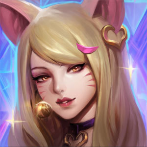

 that is still really cool looking, except the bare feet, not a fan of those.