These new Champion Splashes

Orbv·10/15/2014, 7:01:22 PM·3 votes·609 views

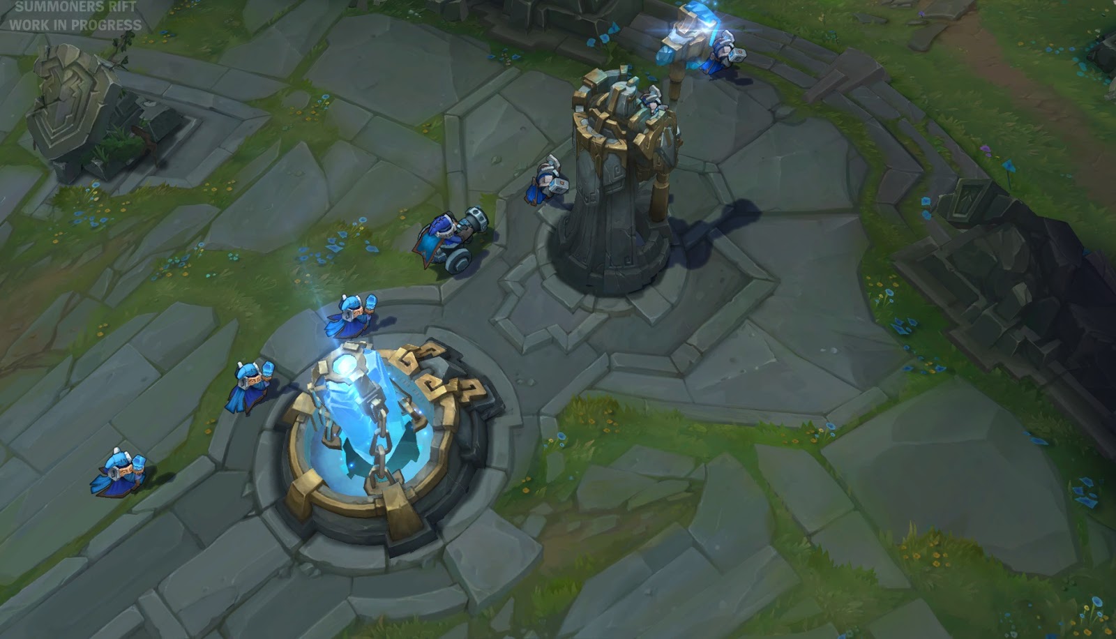
Does anyone think that Riot went overboard with the back splashes of heavy Blues and Purples? There's just so much of it. I almost forget about shades of Green, Yellow, Silver. I think they would make them more lively. Right now they are all getting this animation movie look, and it's the polar opposite of what they are doing with their in game models with the new Summoner's Rift.

If some haven't noticed, the new SR has a cartoony look with vibrant colors. But the splashes have more serious color schemes. It doesn't mesh...


3 Comments

Orbv10/15/2014, 7:50:20 PM3 votes

Something about texturing makes the difference between a cartoonish feel and a serious one:

http://yurixy.files.wordpress.com/2014/02/originalsummonerrift2.jpg

vs

http://1.bp.blogspot.com/-Uza5sTYkXjQ/U6DWX6JrdPI/AAAAAAAAR1E/LAS5gE4Fwpo/s1600/bluesr.jpg

This applies to most movies as well. If you watch older animated movies, you'll notice the trend of which ones are more fraught dread and those which are light hearted. Disney in general is not a great indicator.

http://ia.media-imdb.com/images/M/MV5BMTYwNTA4NzY1N15BMl5BanBnXkFtZTYwODE1NzM5._V1_SX640_SY720_.jpg

vs

http://upload.wikimedia.org/wikipedia/en/7/71/Trollcentralpark.jpg

Lemons2210/15/2014, 7:28:09 PM1 votes

The new splashes have their own cohesion...that's all that matters. They don't need to match summoners rift, and I wouldn't say the new summoner's rift is that "cartoony", it's probably a bit more serious than the the current right imo.

Robins Tights10/15/2014, 7:53:16 PM1 votes

I don't know about "Cartoonish". But it looks more bright and less rough. Looks like clay. I do agree though that it's completely different from the splashes. BUT as that person said below, at least something is consistent.