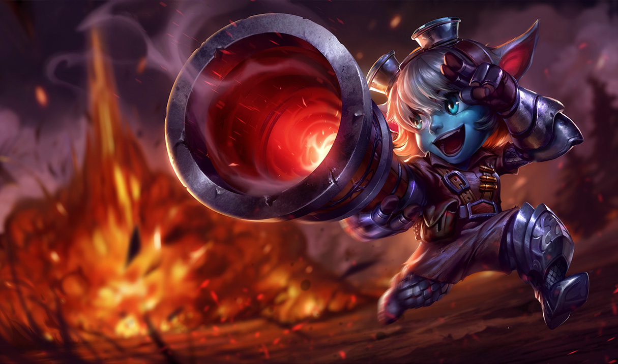
Tristana's new splash art

Why? This is so hideous I don't even know what to say. The quality may be better but the style is just... wow. The old splash art was unimpressive but at least she looked kinda cute. This is cringe-worthy.
Why? This is so hideous I don't even know what to say. The quality may be better but the style is just... wow. The old splash art was unimpressive but at least she looked kinda cute. This is cringe-worthy.
elaborate, can't just say something looks like shit and not give a reason
I have to respectfully disagree with you. The new are is fantastic. The old art was just bland, and didn't show any personality. The old one just had tris standing there looking at the camera. Blahg.
This one is so much more fun. She is having a fantastic time doing what she loves! Blasting things. You say her wardrobe makes no sense. Look at here abilities. She Blasts the ground beneath her to launch herself into the air. So she has some better boots and gloves.
Also, take a look at the old art. Tell me that it looks good. It pains me to even look at it.
[deleted]
Her mouth is too big, her hairstyle looks like a helmet. Her clothing looks like she got it from a goodwill costume shop. The explosion in the background looks cool but I don't like anything about Tristana herself. It looks silly/goofy. If that's the point well... whatever, but... nothing looks congruent within her appearance. It's not stylish, it's not steampunk, it's not visually appealing.
Lulu is a yordle too, right? Her art looks perfect to me. Her wardrobe fits her character, very well drawn and makes her look really cute. People misunderstand what I mean when I say cute, I don't mean sexy or hot, I mean cute. I stand by what I said. I think this new art is terrible because of all the style mistakes, Tristana looks like she's on PCP now. Neither her old art nor new are very "cool" looking to me.