New Texture Updates

Gixia·9/12/2014, 9:21:41 PM·7 votes·1,775 views

I understand that the intention with a lot of these new texture updates is to draw attention to certain details more than others, or make things like particles stand out, but still...

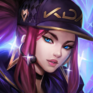
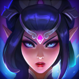
Do they all have to be so flat and... bland looking? I'm looking at the new textures on the PBE, and so many of them just look so flat and uninteresting now. Orianna looks like she's covered from head to toe in a thick layer of dust. Akali's hair practically looks like it's one solid colour in places (especially on her stinger skin), not to mention the new texture on it just draws more attention to how bad it looks. Nautilus and Xerath look like they're not even in the same style as other League characters anymore, the loss of detailing makes them somehow look like cartoons. LeBlanc looks like she got a tan that doesn't match her splash art.

Not all the texture updates seem to have this effect, but certainly a lot of them do. I understand that to an extent, the desaturated look is intentional, but still, isn't there something that could be done to make these champions 'pop' a little bit better? Something to make them look more colourful and less drab?

12 Comments

Dies to Wolves9/12/2014, 9:27:42 PM7 votes

The Akali change is an utter disgrace, and that's coming from someone who hates Akali.

Neo Cyrus9/12/2014, 11:20:46 PM4 votes

They removed all detail and all shine. Metals and hair look like plastic and it looks like the game got downgraded by 8 years.

Ironclad Dragon9/13/2014, 1:54:59 AM2 votes

Cough

It's a comic art style.

Devi0u5 Jinxz9/13/2014, 1:22:45 AM2 votes

Just one thing, Why did they have to take the silver out of Akali's blades :( Hopefully that gets fixed when they finish their PBE.

Icedteaisgood9/12/2014, 10:22:26 PM1 votes

Yeah, Akali's already a really rough looking champion, so this latest nose dive in visual quality for the sake of "readability" is pretty disappointing.

JustBoneBrook9/13/2014, 3:40:25 AM1 votes

You shold update Olaf art Olaf

Tsunday9/13/2014, 3:44:42 AM1 votes

Really because Akali's old hair looked like she hadn't showered in weeks. It was full of grease. As an artist one of the first things you learn is never to use white (or just add white to the base tone) to create the highlights. I think her hair looks so much better and her clothes in all star/crimson don't look like plastic anymore.

I don't think some testure updates (looking at Ashe here) look tat different, but I absolutely love the soft look of Orianna, Leona, and Nautilus right now. Could you picture Orianna's metal body fitting in with the new Rift? No, I couldn't even stand looking at the glaring metals while on the old RIft (which explains the fact that I currently have TPA, Bladecraft, and Gothic Ori)

I'll admit LB looks a little weird, and Xerath looks as weird as Xerath always does, but for the most part I absolutely love these updates so far.

exarke9/13/2014, 5:21:35 AM1 votes

I came here to post basically the same thing and was glad I found a thread about this already.

I'm really disappointed by the loss of detail in the new textures. I understand that Riot's reducing overinformation and cleaning things up or whatever, but why not have each champion be a shape of one solid color? That's very clear information. Oh that purple triangle is Leblanc. She doesn't have a staff or even limbs to distract me so I can focus on the fact that I've been 100-0'd.

I understand and agree with needing to change the shading to match the new map better and improve the hierarchy of information. I think that needlessly removing detail ENTIRELY is bad for the life, atmosphere, and integrity of the game. There must be a way to maintain each champion's level of detail and still accomplish the TUs goals, instead of whitewashing Akali's kamas.