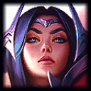
Can Riot please get their shit together on these skins? Splash art is beautiful. Model preview gif looks good, too! In-game screencap is both different AND flat-looking.
Why is it that almost every skin has these problems? The 3 images above have 3 different sets of details. For example:
- Splash has sheer pink open sleeves, other two are opaque and closed.
- Model preview has sheer white side panels, splash has pink, and in-game has opaque purple.
And like virtually every other skin in the game, this one looks like it's shipped only after being stripped of contrast and color saturation. For example, the preview has obviously bright white edges on the weapon blades that just look dingy gray in-game. All the shadows are brightened to gray, and most of the highlights are dimmed to gray.
And what's worse is that this is intentional. PBE skins tend to be more vibrant and detailed before they're sent through the "shitify" machine to remove anything more ornate than a gradient. (See Ezreal Ace of Spades).

 B**** don't dress like me
 , complete with an Iroh beard and barrels of tea.
 nation attacked.