Anyone remembers Katarina's old splash art?

gaby1best·7/28/2015, 3:20:33 PM·15 votes·13,499 views

And how everyone said the new one sucked when it was changed? Now, because you all forgot about it and got used to the new one, which one looks better? The new one, ain't it?

Same will happen with the new HUD and the new Fiora.

52 Comments

Budupops7/28/2015, 4:55:44 PM11 votes

i still like the old one

Stellafreyja7/28/2015, 6:36:02 PM6 votes

I had heard about this. When I started playing, Katarina's had her current splash art. When I look back and found her old splash art I thought it looked so bad. Then, when Fiora's new splash art was released and apparently people through a fit over Katarina's new splash, I was in such disbelief. The style on her old splash is so plain and conveys almost nothing about her character. The new one looks amazing because it shows her in action, using her skils (Shunpo) and fighting people. This conveys far more about her character and playstyle then her old artwork ever did.

MAN OF INTELLECT7/28/2015, 4:14:25 PM5 votes

Old one looks like a doll. New Fiora and new HUD way much better than new Kat skin IMO.

But yes sir, you are right.

PapaGreg217/28/2015, 7:01:12 PM4 votes

[deleted]

Serevas7/28/2015, 3:29:30 PM4 votes

I still don't like the sharp edged features and the insane body position of the splash art, but overall it's an artistic improvement technically. I just stopped caring because:

  1. I rarely play Katarina, and when I do I use the Warring Kingdoms skin so I don't look at the splash for her classic skin anyway.
  2. Riot obviously isn't interested in redoing it even if there were still massive amounts of complaints commonly, which is fine that's their right, it is their game after all.
  3. I have more pressing things to think about rather than splash art , such as balance changes that actually affect the game.
The Whamboozler7/28/2015, 9:51:16 PM3 votes

Old Kat art was better. By leaps and bounds.

The Swaggot7/28/2015, 6:56:44 PM3 votes

the old one is better

Yatsufuså7/28/2015, 6:31:55 PM3 votes

Old Kat is better imo

Yash Gautam7/28/2015, 3:24:50 PM2 votes

I still like the old one, but idc about the fiora splash or new hud

Fowus7/28/2015, 5:16:41 PM2 votes

I used the old splash for science ( ͡° ͜ʖ ͡°)

imo it still looks better

Dedrius7/28/2015, 6:33:12 PM2 votes

The action shot in the old splash is too good to get rid of

agbudar7/28/2015, 7:02:41 PM2 votes

old one has better boobs tbh so old one wins

IcyPepper7/28/2015, 8:28:28 PM2 votes

Now, because you all forgot about it and got used to the new one, which one looks better? The new one, ain't it?

No, I still prefer the old one. The new one is just something I have to live with, like it or not.

ElJanitorFrank7/28/2015, 10:56:17 PM2 votes
Only Play Darius7/28/2015, 11:11:50 PM2 votes

They had to redo the face on that splash just like they had to with Fiora's. Your argument is weak. http://1.bp.blogspot.com/-0196hHCix24/VN0Nm-AeSnI/AAAAAAAAj3M/628tyQLeFDk/s1600/katarina_Splash_0.jpg

1011001110007/29/2015, 7:00:26 PM2 votes

I actually still prefer the old one. The new one hardly provides anything that the old one didn't, besides better detail, which honestly could've just been done on the old splash art without any problem.

BetaDude407/28/2015, 4:16:26 PM1 votes

Lots of people complained about how screwed up Katarina's spine and everything was in her new splash art (which, given, doesn't look comfortable). Although, her old splash position wasn't really all that much better, honestly.

Zephyrous X7/13/2016, 7:27:59 AM1 votes

the old one is still better

O Fallen Scholar7/28/2015, 10:58:59 PM1 votes

New art is awesome but I hate her pose so much. That's probably why her face looks so derpy. Because of that stupid "action/shunpo" pose.

zrWQMdGHtY7/13/2016, 9:21:09 AM1 votes

Love the new one, love the old one, cant pick. It's just Kat ^^

Decrit7/29/2015, 12:50:45 AM1 votes

New splash Kat vote here

Kinjishi7/29/2015, 12:59:21 AM1 votes

No, the old one still looks better. Besides, they did edit the new one after complaints - which you fail to mention. Also, the new one still has that hip bone issue. ewww, makes her look too skinny

WyvernEgg7/29/2015, 6:52:35 PM1 votes

I still like the old one

Linna Excel7/28/2015, 5:16:36 PM1 votes

In terms of detail the new one is better. That said I like the old one more.

Elipo7/13/2016, 9:44:38 AM1 votes

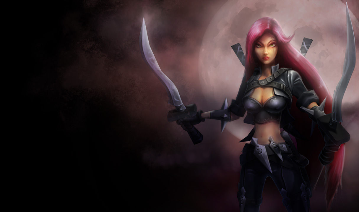
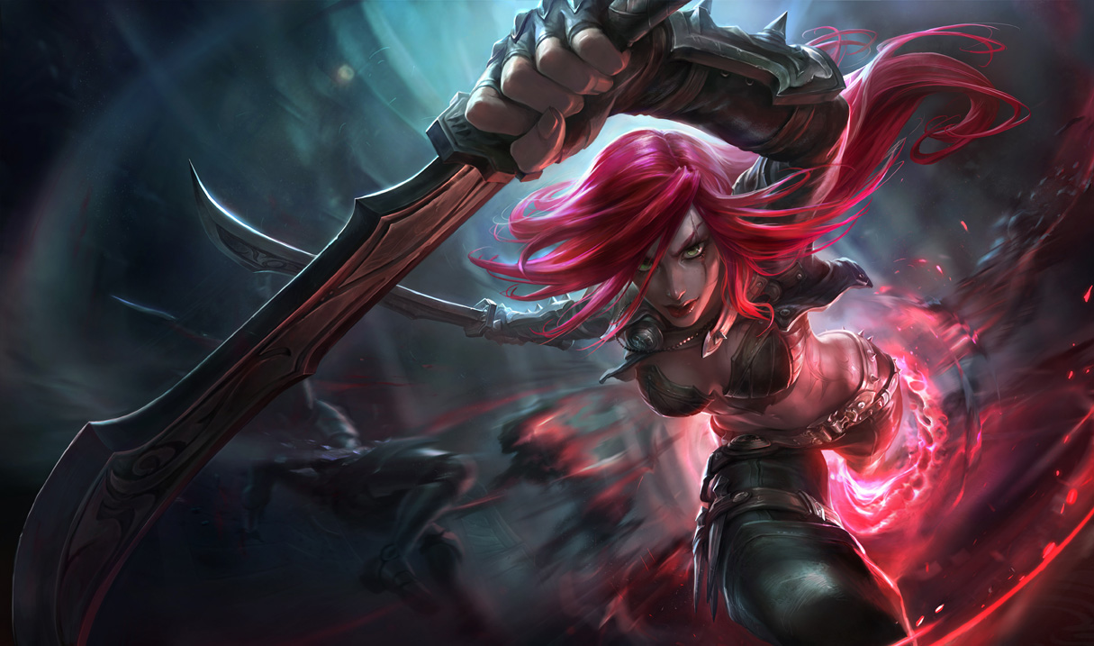
I liked more the new one since it appeared (I only got to see the upgraded version, though, not the first one that looked uglier) because even if the first one looks nice, she doesn't look like a vicious ass ass in, but just like a pretty girl in black clothes, and when I saw the new one I was like: hell yeah, now she looks like she wants to kill someone.

And as for Fiora, I always thought she was ugly, with an ugly splash art, so when the new one came out it didn't bother me at all, and then riot confirmed that to them Fiora wasn't supposed to be pretty in the first place and that they were surprised that her fans thought of her as pretty and demanded a pretty splash art, so... yeah Also, in her old splash art she just looked like a normal girl with ugly make up posing with a sword, but her facial expresion wasn't that of a proud duelist, but then in the new one she looked fierce, and proud (she didn't look pretty, but to me she was never pretty and the rioters said that to them she wasn't supposed to be pretty, but changedit cuz of the fan bois)

CharQueen7/28/2015, 8:25:46 PM1 votes

I think the older one looks a lot more professional. I think the newer one represents her gameplay.

I like the new artist, and I think they should just combine the two aesthetics.

EC30454/10/2016, 9:19:10 PM1 votes

Now that insee the old one again im reminded of how bad the new one is.

Auryiel7/28/2015, 9:37:30 PM1 votes

Her old one was outdated and needed to be changed

Her new one is still bad

There's some good elements. She has a more distinctive face (which is very different than the one she had at first), it's more detailed and more exciting. That doesn't excuse the absolutely god awful pose, proportions and body distortions. When you actually look at it for more than 2 seconds, it gets uglier and uglier. That, to me, is a sign that the artist behind this piece is quite frankly not very good.