Who tf did this to Pyke!
Words do not sum up my disappointment.
Words do not sum up my disappointment.
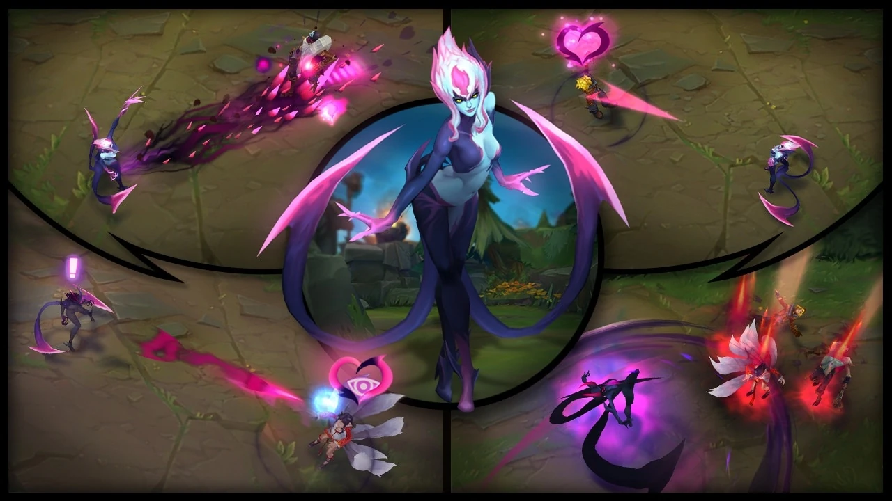
They did the same thing with  's rework. The teaser made her look like a wraith/not human and in-game she looks way more human (obviously not completely human, but more human than the teaser).
https://i.ytimg.com/vi/EgRZOc4YKmk/maxresdefault.jpg
Pale skin, glowing white eyes, faded purple hands that blend perfectly into the claws at her fingertips
https://vignette.wikia.nocookie.net/leagueoflegends/images/8/8f/Evelynn_Update_Screenshots.jpg/revision/latest?cb=20170926194205
Blue skin, has normal eyes w/ pupil, cartoon-y, glowing, pointy hands
's rework. The teaser made her look like a wraith/not human and in-game she looks way more human (obviously not completely human, but more human than the teaser).
https://i.ytimg.com/vi/EgRZOc4YKmk/maxresdefault.jpg
Pale skin, glowing white eyes, faded purple hands that blend perfectly into the claws at her fingertips
https://vignette.wikia.nocookie.net/leagueoflegends/images/8/8f/Evelynn_Update_Screenshots.jpg/revision/latest?cb=20170926194205
Blue skin, has normal eyes w/ pupil, cartoon-y, glowing, pointy hands
Sadly, there are sacrifices that must be made to make the character read well at a low poly count :(
you vs the guy she tells you not to worry about
Sorry, we forgot to take off the Fast Food render for Pyke :(
I don't think anyone here's every actually tried to make a model readable from a distance, which is exactly what this is.
Like every other champion in the game, if they were rendered at the same level if detail in the trailer, you would likely not see a lot of their character details, which is not only a waste of resources, but actually clutters up the model and makes it hard to see what it's doing.
League models are made to be readable from the farthest zoom. Zooming in closer with high expectations is only a one-way trip to disappointment land.
Um...So I've only seen that teaser image so far and I gotta say.
This post made me realize that's a bandana, not his real teeth.
I thought he was some hellish creature. So I'm disappointed on a completely different level.
They took something great to show the world Turned it into a plain cheeseburger from McDonalds
Atleast it has cheese?
I started wheezing when I saw him in game tbh, my sister came up behind me and said "looks like the guy I like compared to the guy who likes me." I couldnt stop crying and laughing?
lol, who made that? They could at least get rid of the mouth line and add at least say... 4 more teeth? not that it really matters tho
Y'all, have you ever actually looked at the in-game assets, pulled apart? The texture files for champions are like... tiny lmao. I don't understand, when you are in a teamfight or whatever, you cannot tell me you ACTUALLY are looking at the minute detail on Pyke's bandanna.
Like, the texture files are 512 X 512. The splash arts are AT LEAST 1280 x 1024. So they have AT LEAST twice the resolution, and I would not be surprised if splash arts have more resolution than that.
This game is meant to run on lots of different computers, that means small texture sizes and low-poly models. The boards complain all the time that the character model doesn't look like the teasers and splash arts... they probably won't. You should be glad they don't, because it means your friend's toaster can run this game, too.
I think its funny that after all this time people still don't understand the difference between splash art and in-game models. In-game models are not going to be as detailed... ever. Certainly not as detailed as the pyke splash.
If they tried, it would come out as a color blob. It's just too much detail. Riot has actually said they do this for clarity reasons. The style of art in their game is for clarity. They do not overload their models with too much detail to avoid rigged edges and color meshes. They favor crisper, cleaner looks for clarity.
Looks like some black guy whose having a bad day
The assassin support needs cheese
same thing that happened to sweetheart rakan: its underwhelming and you don't listen to your fanbase. no matter if the textures are "too loud" in a particular spot (his face) - right now they're "too quiet" and look silly, even fully zoomed out you can tell its not the mask shown in the teaser on the first glimpse of this champ and it looks utterly cheesy. its not well executed, not what we expected after seeing the teaser! this is a WHITE mask, not a crisscross red-white mask. you did the core look of the champ wrong. twice! we need at least 3 more red lines on this to look somewhat like the teaser. in this state its too costumy and looks pretty cheap. not scary at all
also you did horrible on the emote. your argument on the rakan fan-skin was, that its too detailed and not read-able when zoomed out. yet you do not add more detail to something big popping off on the screen like an emote
i truly support almost everything you guys put out, but this is just lackluster, looks cheap and is underwhelming. to me the look of something gives it a unique feeling. having to look at this makes me feel uniquely bad