Riot, just make a new Collection tab for Eternals. The new champions tab looks terrible

Naalith·8/28/2019, 8:10:45 PM·234 votes·30,784 views

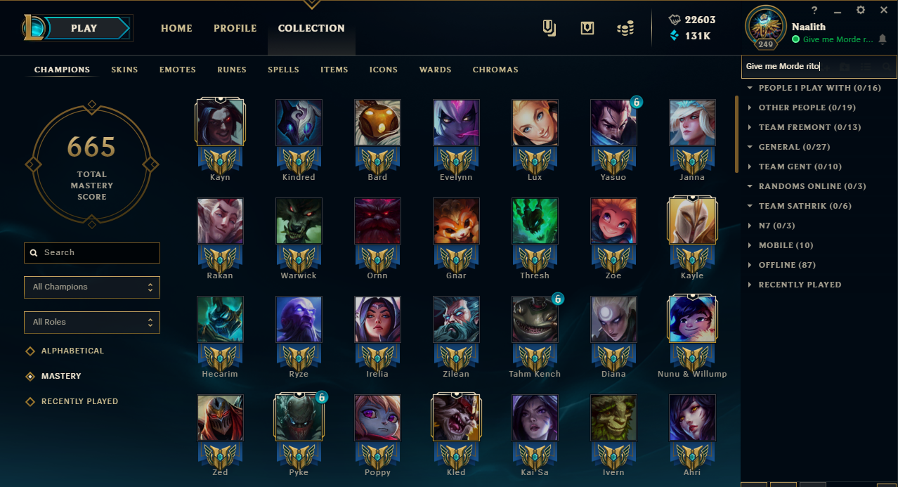
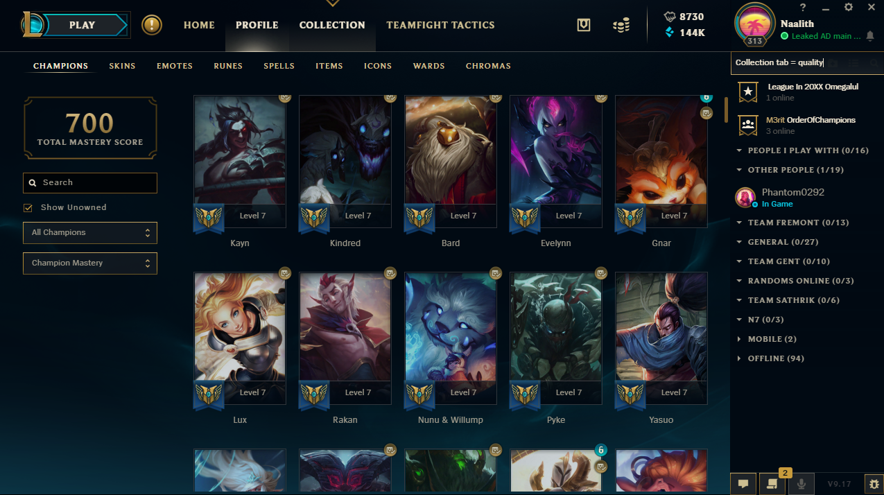
Look I get it, you want to throw a spot up in the collection menu where everyone can go and look at their overpriced achievements which have hilariously been dubbed "Progression" in the tab despite the fact you have to pay for the right to progress. However, the Champions tab is way too spread out now and it takes roughly 10-15 years to scroll down and find which champions you haven't gotten Hextech chests on this season. Just compare the old look (taken from a screenshot I did a few months ago) https://i.gyazo.com/bfab671eb6416afa1777dd54bea9ecdc.png To this new... abomination https://i.gyazo.com/e19f7c4b2c65e71724f85ff12698fec3.png The old tab was so condensed. Small rows, 7 champions per row instead of 5, they made a little border to see which ones you have your Hextech chest on for the season, and if you wanted information you could mouse over them. It was so good. The new tab only has 5 champions per row, only a couple full rows per screen, and even you people admitted Eternals are probably gonna be bought on like 1-3 champions per account so why mess up this entire screen.

This is an abomination to my eyes, you're making something look worse for the sake of selling overpriced bullshit that should be free. You want to make a cheap moneygrab? Fine, make a new tab for it like you did with Emotes. Making a working feature worse to prepare it to sell us shit is asinine.
77 Comments

wolvius8/28/2019, 8:57:42 PM68 votes

Don't forget that the icon for earning a chest isn't consistent, if a champ is on free rotation the blue lock symbol takes the place of the chest and moves the actual chest symbol down. Thats if you can see the things as half the symbol is cut off.

Chembaron Yamada8/28/2019, 9:05:19 PM45 votes

I mostly miss the borders for the chests. These new icons are so small, that I actually have to look really close to determine who I am still able to get chests on, meanwhile the old border (which had a BEAUTIFUL hextech design) was able to tell me the same with a short glimpse.

Nea1048/29/2019, 1:10:45 AM18 votes

If it's not broke, don't fix it .

Spend your time on what is actually broken, and quit with this Eternals sad stuff.

Xplosion1018/28/2019, 9:07:36 PM14 votes

Nice mastery flexing ;)

(Don't mind me jk, also just wow)

Garen is adopted8/28/2019, 9:26:20 PM9 votes

Spoiler: is for their shitty android version that will come soon cause they had no idea how to do separate menus for pc and phone

R1ngwra1th8/29/2019, 3:59:32 AM9 votes

Change it back please. @Riot

NytDwellur8/29/2019, 3:39:22 AM9 votes

I don't really understand why they felt the need to change the interface... I'm glad to see that I'm not the only one that thinks it has lost a lot of clarity and readability with this change. Before, I could quickly glance and see which champions have available chests and which do not, and now this isn't possible. The champion pictures take up a ridiculous amount of space as do the levels (which are completely unnecessary). I really hope they realize that they've gone backwards with this implementation as it feels like a truly amateur design (both visually and in its usage) that was not thought through or tested properly.

whitewash788/29/2019, 3:45:45 AM8 votes

I hate how much time it takes to go through your champs now. I liked being able to look for a little bit and easily see which ones I had and which I didn't on my different accounts.

Azemor8/29/2019, 4:13:59 AM6 votes

Yeah it's terrible, it's not clear at all. The previous version was way better, simple and clear as it should be, not some wana be fancy bs. I really don't get this, why doesn't this get polled with the community first if people actually want this change and what they would think about it etc. This is just really a waste of employees' time. As someone stated here before : if it ain't broke, don't fix it Please revert it

ShadowGlaive2138/29/2019, 1:03:49 AM5 votes

I don't understand why when I sort by ownership and mastery the Free Rotation is listed first...

Summoner SpeII8/29/2019, 1:12:33 AM4 votes

at least riot added a new feature in champ select for normals where you can see the champs u can still get chests for

Dirgo8/29/2019, 3:22:37 AM4 votes

Remember when you could have your friends list not always on your screen, and you didn't have to search for everything in whatever tab they are in? Ahhh

NabotoGaming8/29/2019, 5:03:27 AM3 votes

It has potential, but not everyone wants something like this. If they added an option to change the icon sign from big to small, it would be fine to keep here for those who might want it. Also I agree with why did they "fix" it when nothing was wrong in the first place there was no reason behind this except to push people to get eternals.

sometimeitdo8/28/2019, 11:07:18 PM3 votes

Don't worry, pay to win will destroy this game for the final blow. I said in s4 this game was dying (it was and still is, but rito stopped showing the average numbers back then so no one would see the drops), and now rito is attempting to gouge more out of their playerbase. I dont even have to go into details, as there are plenty of posts detailing why this game has failed its' players. I'm all for changes and updates, but I've spent 1200$ on one account on skins alone, I should not have to pay more to buff a champion. Completely sad.

Shieda Kayn8/29/2019, 11:36:59 AM3 votes

It's incredibly fucking buggy too. If only there was a way to test things to make sure they're as free of bugs as possible before sending them live...

Coins8/29/2019, 5:24:29 AM2 votes

Talk to the community before dumping resources into a feature that we might not want.

Also, do you even hire UX designers? The top row of champions have their chest symbol cut in half, and the free week symbol pushes the chest symbol down, creating inconsistencies. Less information is available in the same amount of space (it feels cluttered), and it takes longer to scroll down to the bottom.

Also, do you even hire testers? The Mastery level displayed on the champion is wrong. This should have been an extremely easy bug to find.

Please, put it back to the way it was and just make a new tab for Eternals.

Diävolo8/28/2019, 11:39:11 PM2 votes

I agree with you. Can I get Odyssey Kayn ? Mods I'm just kidding, ffs stop stalking me

Taktical8/29/2019, 5:05:26 AM2 votes

Personally, im a big fan of the changes. I do miss the chest border, but the new screen makes it easier to find what your lookig for faster. The big art shows more of the characters personality aswell and has a better designed box for all the info needed. Rengar

Azanoz8/29/2019, 6:23:39 AM2 votes

I hate the new one

hhaavviikk8/29/2019, 6:49:12 AM2 votes

I got the exact same problem with champion select, used to be able to see so many champions on champ select now you can see significantly less of them and have to scroll much more

Boltonator8/29/2019, 2:33:36 PM2 votes

Just want to point out that they also made the mastery icons in the loading screen about three times bigger, while condensing the size of your profile portrait. Pairing this change with the collection tab changes certainly makes it feel like they’re doing everything they can to push eternals in our face.

ObamaComeHoooome8/29/2019, 9:41:11 PM2 votes

yeah tbh this looks awful

Lord Kelteïr9/30/2019, 8:57:09 AM1 votes

Up ! I agree so much, pls Rito give us the old collection back.

ObamaComeHoooome8/29/2019, 9:42:00 PM1 votes

typical advertisements that grab our attention and display themselves as large as possible to say "BUY IT TO FEEL GOOD."

lostbob1178/29/2019, 9:46:29 PM1 votes

New one looks pretty good, just because you prefer the compact one doesn't mean the new one is terrible.

Maybe make an option to choose between the two

LatetotheRace8/30/2019, 4:18:36 AM1 votes

Your friend list looks like mine, empty :/

Zolokhan8/30/2019, 11:29:47 AM1 votes

It sucks. You cannot easily filter the champs ... its too big for no reason. If they did this for phones they need to have diff one for pc

La Belle Sauvage8/30/2019, 1:25:20 PM1 votes

I don't mind the new look so much. But I appreciate your point.

Barny Miggo8/30/2019, 2:51:30 PM1 votes

Sadly Riot has a tendency to not admit their mistakes and keep trying to rework the new bad stuff instead of reverting to old ones. Honestly I don't see how they make their decisions for the interface of the menu and profiles, old profile pages were satisfying as hell to look at, the old ranked icons looked more intimidating, you could see the points of all your top 3 champions, the 3 ranks you had in Solo, Flex and TT. none of the useless crap like the Clash banners and Honor level badge which is literally useless because no one can see it (basically these two stay empty for the majority of players). And they fucked up the login screens, the old ones were so satisfying and perfect, especially when you combine your 7lvl, ranked border, champion icon, skin and (if you're one of those people) skin border. Now you have to hover over people to see their level and their points, at least they could've added useful stuff like their current rank, win rate and games with their current champion, to hell with the mastery points, I have more than 1mil with Jax on all accounts and I'm still average with him and I couldn't care less if I'm playing against an OTP or your regular "first time playing this champ in ranked" Joe. And the one thing I will absolutely never forgive them about is the rework of Aatrox. He's kinda fine now (statistically), but has been shit for the majority of the time he's been out while Riot was trying to make him work while failing so many times instead of reverting him. And let's be real, he has absolutely no resemblance to the old one, so Aatrox basically got deleted from the game and replaced with a new champion with the same name and similar aesthetics, they changed his playstyle from a hypercarry splitpusher to an AD caster teamfighter. But I digress, Riot really puts their nose in stuff that doesn't need any changes, and some of it might be small stuff but it adds up with time. Don't take me as nostalgic but the old champion select (first one with the lane choosing) was so good and they added some useless special effects and even more freaking circles and curves in the design, and also the old launcher was so much superior to this one, I still get annoyed with stuff on the new one and think "man why didn't they keep it like it was in the old one". Whatever I guess, in the end Riot is a company like any other and tries to please investors and make as much money as possible, I don't really think they have much passion left for the game (with few exceptions of the staff of course, I don't want to generalize) and make changes for the sake of changes just to keep the game alive and make some cash from the weebs that buy their softcore skins.

Flashes8/30/2019, 5:53:15 PM1 votes

How do you even see if you've gotten hextech on a champ yet

Wexem9/1/2019, 7:05:46 AM1 votes

My problem with this thing is that when I'm playing at smurf from time to time to try builds and champions that I'm not used to so I can try it instead of trolling by 1st timing and I want to check if I own a champion for the testing, I used to click the collection -> champions tab and instantly saw everything. Now I'm forced to scroll down and can't see everything at once + imo it's really fcking ugly looking. I know it's for the Eternals or whatever but I think champion collection was suppused to show you what champions you have or do not have + show you the rotation, It was this way since season 1. I don't get it why would you change it, making the borders that big makes it really hard to operate. I think the solution would be adding another tab ETERNALS when u click collection and leaving the champions tab alone.

Infinitty9/12/2019, 9:45:43 PM1 votes

You have an option to display only the champions that are eligible to win chest. And I like this new design better. Ok it have the con of less champions per row... Other than that looks nice.

YiaSkrZ8/29/2019, 8:58:59 PM1 votes

:/ that's true.