Why i think the new Hud needs to be improuved

Why i think the new Hud needs to be improuved
1- Xp bar Ok so first, the main thing i really don't like about the hud is the XP bar. Making it in round wasn't the best call in my opinion. Being a main support, it makes it difficult to know when to engage lvl2 or to knows when i,ll be lvl'ing up. I think the color also don't help. THe old yellow was really catchy to the eye, the XP bar is now purple over black two color that for me don't stand out as much as the old yellow gold vs dark.
2- Shop
I understand that we might not be use to click shop on the right instead of the left, but i agree, putting everything on the right seems kinda weird to me, i do feel like am constantly looking at the right side of the screen, and never on my left side. Then once you clicked it and are actually in the shop, things goes worst. I have no idea why the shop sound has been change. Sound in game are a very important thing, it make you more efficient in every game, (footstep in shooters for example) the old shop sound was clear and loud, we could click the number of pots we want and the sound would tell us if we bought the right amount. now the sound is so low (and weird, bard meeps 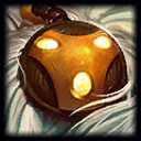 ? ) that you actually have to buy then look at your item to confirm that you bought the right amount. (i understand that people might be like oh well just know how much time you clicked) but things arent that simple. sometimes you are in a rush to buy and have to press everything super quick, sound really helped. witch is not the case anymore. I could also make my shop shound highter. but shop sound is now merge with gankplanks
  commentators and gawd this guy talks alot in game... so this inst a viable option either.
3- Cooldown
I dont think items on cooldown should all have the same icoon. Its very hard to deal with asa support when your having like 4 activating items to knows witch item is witch and whats the cooldown timer on those. Same things with the trinket items. I really miss the grey. Now i really have to remember where i put witch item cause if i dont, i just have to wait for the cooldown to end to actually know what item it is. This affect the gameplay in many ways. For example, lets say we just losed a team fight, then we regroup and try to counter baron, there is no way for me to know quickly when my mikael  will be up since my solaris
  is also on cooldown. The cooldown icoon should not hide your item icoon. Items activation and cooldown should be very easy to see cause you need to know in a matter of 1/2 second if you can or not use them and when . (and also it helps to know witch item is witch.. =_=)
In conclusion, i think what Riot should have done is actually kept the old Hud till they figure out a way to make us move the diffrent part of it as we want (kinda like the new tab systeme where you can switch information all around the place) with a costom hud i dont see why people would still be mad about the new hud.
Also , i though the majority of the player were mad about this new hud, i was surprise reading the comments saying that the majority was ok with it. All my friends feel like this hud is worst that the old one and that some changes should be made.
On a side note, i love the new map design and how you can see death timer without clicking tab. If you guys really need to make the hud smaller and compact why don't you remove the picture of the character ? I'm pretty sure no one forget witch character he's playing while ingame. I dont see any use for it,
Thx for reading, and hopefully this will help and things will change.