Mastery 6 & 7 Colors are Flipped?

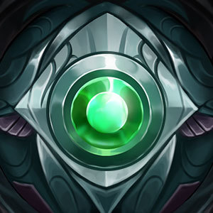
The purple banner looks way more prestigious (royalty) than the blue banner, but it's the blue banner that is the higher level.
The blue banner could at least use a brightness bump.
The purple banner looks way more prestigious (royalty) than the blue banner, but it's the blue banner that is the higher level.
The blue banner could at least use a brightness bump.
I like the way Mastery level 6 looks more too.
Spamming mastery 7 should shoot a blinding light in game.
Agreed, Purple is better than Blue - never upgrade!
Lulu knows what I'm talking about.
its about color order. red, into purple, into blue. purple is the color between blue and red.
I like the blue one. Purple looks like an unfinished Mastery to me.
The blue one is better, as it looks super badass on loading screen on my main :3