https://i.imgur.com/50N6GEW.jpg
https://i.imgur.com/alGo8GD.jpg
borrowed these from another post. They are larger there but copied the link name which is how he/they pasted them so not sure how his is bigger and my version of same post is smaller :P. but the first one is current 'small window' version. I dont really want anything on there. I want whats in the other just without any of the info thats in the former. Get rid of everything on the top and on the left and enlarge everything that is left. See all the spell icons with the dmg. cant see any of that. might as well not exist. get rid of the pie circle. get rid of the kda, get rid of the dmg type, fight length, cc length, phsycal/magic/true. Keep them as legend info so I know magic is blue, true is white, phsyical is orange put that at bottom so its not drawing the eyes stick it to the right for same reason make it small cause once u see a legend u never need to see it again. then enlarge the individual champ spell and dmg per spell type by 5x or more. so its all legible. keep the dmg type colored by legend. some spells do different types need the amount per type but dont want the images so much liked prviously seemed it was named. or it was both. if i dont play the champs how am i going to know which image signifies which spell. at least with the names as earlier i can tell what spell based on naming convention. i died to a pruple triangle. yay. earlier version had spell name. it was just simple. and easy. made sense. now I have to go play all the champs. and memorize the spell icons, then remmber them under pressure at the right time. find thee perfect spot in my memory when the time comes to draw out the icon in the 3 seconds i have in the shop window. exactly what I dont like about alot of apps now. all icons no info or text or hover text. its pray and play, pray and press, what this do hope it aint an icon that means pay us 30$ if u press this. Like this button subscribes u to one year for 100$ and u discover that by pressing it to see what it does. get rid of the stupid icons. always hated icons over info, icons over text. how the heck am supposed to memorize that over just processing simple words like b4.
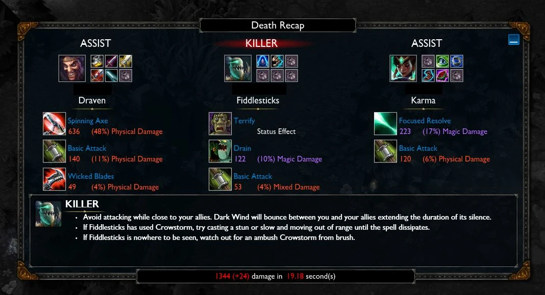
https://vignette.wikia.nocookie.net/leagueoflegends/images/2/28/Deathrecap01.jpg/revision/latest?cb=20130422131732
This one simple to understand and isn't an issue. Don't see the need to change the style. just cause u can. fix bugs if needed but why get rid of the spell names. why make the info too small to read. why get rid of having the percent of dmg right next to the amount of dmg. why change it from columns to rows. that kind of thing throws the brain a curveball.
p.s. see took me however many games, and seeing these images, and looking at them like 5 times, just to realize that that isnt a stupid kda, its the supposedly more reasonable way to word killer vs assist. killer makes sense, assist make sense. But 0/0/1 and 1/0/0 for however long this stupid thing been in existance and every time i've seen it writing this wasn't obvious that that is the stupid as crap new way to signify killer vs assist. oh well. sorry developer u prob proud of this but annoys me. it will prob stay but annoys me. and do me a solid and add the spell text back and make it bigger like old one. and let me hide/enlarge the other stuff that you are showing. the stuff u show is the stuff I wanna minimize and the stuff u hiding is what i wanna see, and by see i actually mean see, which means make it as big as it use to be. looked at several of them now with google images now that I have a menu name type to search on 'death recap league' couldnt think what to call it. Even when I do open in seperate tab as image and then enlarge by 200% via browser, the spell dmg is not legible. do u really want me in game to do screen grabs and pastes and enlarges in paint program or some other stupid thing.
p.s.s only thing didn't like bout prvious one is if a particular spell did 2 types of dmg, it would say something like MINDWarpSpell = 1000 mixed dmg. Would have been better as 900m/100p cause knowing how much of the one or the other is important. what if it did 5 physical and 995 magic. 1000 mixed dmg is misleading.