Hey there, I want to say that I'm liking the VFX changes so far, but I'm also looking to give some of my own feedback on these changes, especially since I'm a Renekton main.
Firstly, at the forefront of my mind are the visual effects tied to his fury bar. I agree that there needed to be some change to the way his rage was visually represented, because for anyone who plays against Renekton, sometimes it isn't clear when he reaches 50+ fury. While this isn't a significant change for Renekton players (who have already developed a good sense for fury management and thus can easily keep track of it), I do think it is important for other players and for the sake of overall clarity.
However, to be blunt, I believe that the visual indicators attached to his fury mechanic are straight up poor, for a couple of reasons. Like others have pointed out [1, 2, 3, 4], the 'glowing hands' theme is overused because of items such as Duskblade and Sheen, and my personal belief is that, in the first place, 'glowing hands' is an unfit indicator for the mechanic that it tries to represent. Unlike auto-attack modifiers, Renekton's fury mechanic is more akin to a state of mind, similar to Rumble's overheat, where both champions have access to empowered abilities once they reach a resource threshold. This is much different from just having another effect added onto your next auto-attack. Not to mention, it will look and feel awkward walking around in lane with all these bright visuals attached to your character and nothing to expend your fury on. It looks silly and feels bad. Imagine missing a Q stack on Nasus and waiting for the glow on your cane to expire while the next minion wave hits. That's how I see it playing out with Renekton, except it'll feel worse when his visual effects are much more pronounced. With all that being said, other posters that I've quoted have suggested that, alternatively, Renekton could instead have fury indicators moved to his weapon, or that he could grow more red with more fury he has built up. I like the latter idea a lot more and I support it.
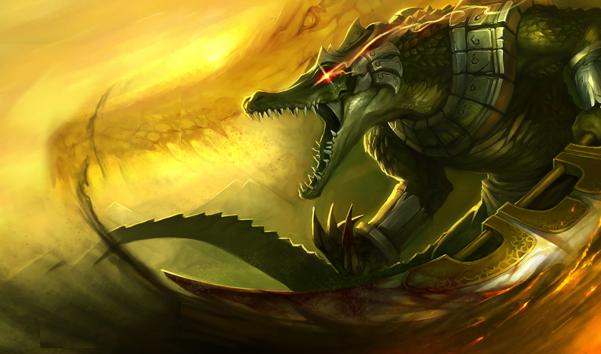
Aside from the glowing hands, I'm a big fan of the red eyes as a fury indicator. The idea is fucking cool and I love it, but I feel like the execution was lackluster, because it looks like someone slapped two red light bulbs on both halves of his head and called it a day. There is another post that reflects my thoughts on this, but in any case, I definitely think it would be an improvement to change the effects on his eyes from a glow to a glint, similar to Renekton's old splash or the icon on Renekton's passive. Personally, I would love to see a darker shade of red used for the glint in his eyes, and I think it would be an even better idea to attach a lingering trail to it, similar to the effects on Deadman's Plate or Xin Zhao's spear when he activates Q. Imagine what it would look like when Renekton dashes or spins with 50+ fury. The last comment I want to make on the fury visuals is that, in the video preview, it was difficult to see the glow on his eyes for the duration of his ult. The intensity of his new sandstorm contributed to the lack of clarity, but I also think the size on his visual effects should match the size increase he gets from his ult.
Moving on from his passive, the next thing I want to talk about are his basic attacks, and by extension, his W. A lot of people [1, 2, 3, 4, 5, 6, 7] don't think that the mini-explosions fit Renekton's auto-attacks. Many of them, like myself, believe that Renekton should have a slicing visual effect to complement his auto-attacks instead. My personal justification for this is that, for one, Renekton uses a bladed weapon, which would only make this intuitive, and secondly, it complements his identity as a butcher. A couple of posters have also mentioned that Renekton's W should have multiple auto-attack visuals instead of 1 when he stuns a target, which would make sense to change because his W is followed by multiple instances of damage. That's all I have to say on his auto-attacks and his W.
I'm really excited about Renekton's new Q and I think you guys did a phenomenal job on it. I'm loving the colors on the empowered version and I didn't expect to see it leave marks on the ground like how God-King Darius does. New trend? In any case, I like it a lot. The only thing I would suggest is to make the impressions left on the ground exclusive to the empowered Q. With how relatively spammable Renekton's Q is, I think it would carry more weight this way if only the empowered version came with that special effect. The idea that he can disfigure terrain if he's angry enough is something I can definitely get behind.
As far as Renekton's new E goes, I like the idea. The only minor gripe I have with it is that, because the sand follows him slowly, it also makes Renekton seem slow during his dash. The motion of the sand doesn't make complete sense either, because he moves like a drill and you would expect the sand to spray outward as a result. Other than that, I think it's a cool concept.
Last but not least is his ultimate. I have a couple of things I dislike about the new ult, but I'll start by saying that the visuals look way nicer than before, which is a plus. It's fitting and it actually looks like a sandstorm. But otherwise, to explain my issues with the changes, I've always thought of Renekton's ultimate as this big power-up that you give yourself to become a raid boss, which in concept, is exactly the same as Nasus' ult. Both of their ultimates are supposed to make them appear more menacing, but with these new visuals, I feel that this aspect of Renekton's ult has been taken away from him. In my opinion, the issue boils down to two things: the new visuals on his ultimate draw too much attention away from Renekton himself, and the other is that you barely notice his size increase anymore. To start off, here is a visual comparison of Renekton's current ultimate vs. Renekton's updated ultimate (as shown in the video). Because there is more action packed into his new ultimate, and lot more space on the screen is taken up by the sandstorm and not by Renekton, there will naturally be a shift in visual weight. More people will focus on what's around him than focus on Renekton himself, which is not the point of a power-up. Even if the numbers behind his size increase are untouched, it doesn't feel like he's towering above other champions. Other people have noticed this [1, 2], and while I'm not trying to make Beardilocks look like a bad guy or anything, it is upsetting to me, given the context of my post, to basically be told to "look harder" for a visual effect that is supposed to be obvious at glance. Once again, I'm sorry, I don't mean to antagonize anyone. But in any case, when it comes to restoring the menacing aspect of Renekton's ult, my suggestion would be to either make the sandstorm more transparent and/or to have it animate slower, similar to the speed at which his current ult moves.
In addition, on the topic of the AOE indicator on Renekton's ult, I agree with Rydon's point about why the indicator is unnecessary. This goes back to my previous point about visual weight, but I also feel that the AOE indicator also detracts from Renekton's size increase. Aside from visual weight however, putting an indicator around Renekton's ult would be like putting an indicator around Tibbers, ASol's stars, Shyvana's W, or Amumu's W when their visual effects are enough to not warrant a clear circle. There is also an argument to be made that an indicator isn't necessary for Renekton because his ultimate is not intended to be used like a zoning tool.
If you've gotten to this point, thanks for reading everything I wrote. I know it may have sounded like I was mostly unsatisfied with the VFX update, but I am happy that you guys are taking the time and effort to touch on these older champions, so this is very refreshing.
EDIT: I forgot to add this in my post because it was minor, but currently when Renekton ults, he flashes his symbol at both the start and end of his ult. But in the video, the end symbol isn't there anymore :( Will it be coming back? I thought it was really cool because it felt like another way to say 'this is the end result' or 'this is what remains.'







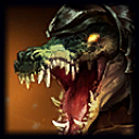 gets an update on his skin splash art. He has had the same skin splash art for almost 3 years now. Rune wars and outback could also get a skin splash art rework. Other than that, Everything is good my dude, well done on the update